Creating User Patience with Loading Indicators
No matter how zippy we make our applications and sites, there will often be something that takes time to process. Loading indicators, often those swirly circle graphics like these  generally show up when something takes longer than a second or two to process. Most of the time, this is for a complex query such as a reservation search on a travel web site or for something like a file upload.
It is a solid practice to use loading indicators in these cases so that the user knows that the action they invoked had some effect. Otherwise, they may assume something is broken or that perhaps that they never invoked the action at all–necessitating another click (and restarting the query).
In my search for progress indicators and loading animations, I found that most applications center their loading concept on some or all of the following themes
Tell the user what is happening
Many times, if the user is informed, they may be more patient. After all, something they asked for is coming–it’s just taking awhile. But be careful about giving an information overload!
If this was initiated by a query from the user, it may be helpful to remind the user about the details in case they made a mistake. No sense in making them wait only to have useless results!

While it's finding my location, Ingress treats me to a neat animation 
Pano gives me a nice little progress bar telling me exactly what its doing. It's merging my shots into a panorama. 
In LINUX, we have the Yum updater. It's maybe a little too verbose for the average user, but then again, LINUX users are more used to this sort of thing. 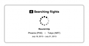
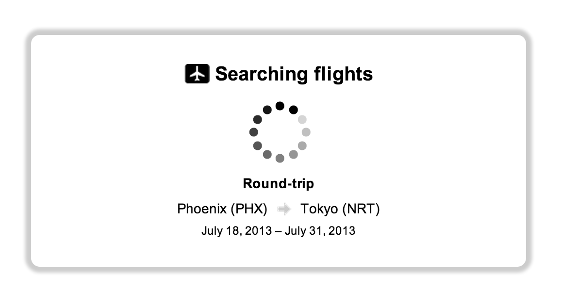
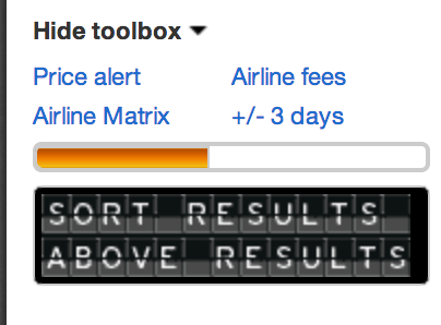
Orbitz tells us it’s searching flights. and shows a generic spinner 
OSX tells us what is happening as it opens a .dmg file


Show real progress
Sometimes this isn’t technically feasible. Databases don’t know when they’ll be done processing your query, and even if they did, it would take another series of queries to ask for the remaining time. However, for things like file transfers this is much more simple. If you take the amount uploaded and divide it by the total file size, you have the percentage of progress.

Wordpress shows this for file upload progress 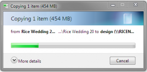
The way Windows 7 displays a pending file transfer progress 
Zeptolab tells us how far along Cut the Rope is in loading 
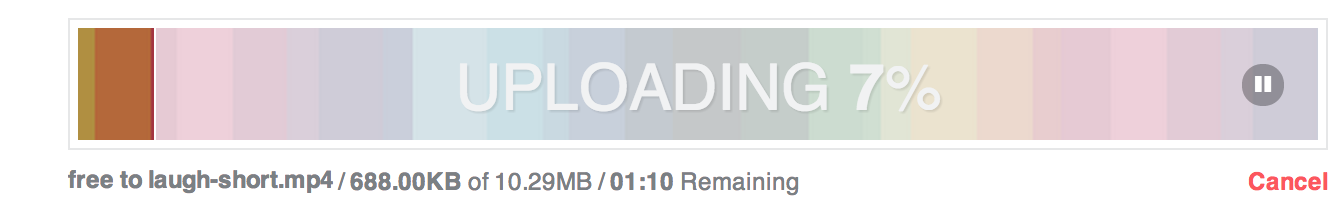
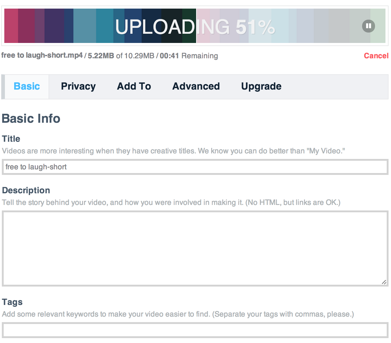
Vimeo's Loading indicator is colorful 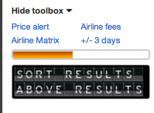
While Kayak results load, the flipboard gives marketing and status update messages 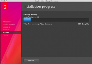
Adobe tells us what is happening and an estimate for how long it will take to complete


Give users something to do
Hipmunk did something surprising with their loading screen: They gave me the opportunity to sign up for fare updates (and probably their email newsletter). Since these searches usually take upwards of 30 seconds, I had plenty of time to digest what I was seeing and fill the form out.
Vimeo allows me to edit my video details while it uploads.
Kayak surprised me also by loading results as they came in. This allowed me to start planning as it finished loading.
Other companies showed ads for third parties.

Hipmunk gives us something to do while we wait 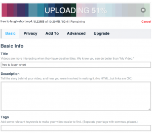
Vimeo gives you access to edit video details as it uploads and processes -
While Kayak results load, the flipboard gives marketing and status update messages 
Expedia shows advertisements while loading results 
Travelocity displays ads while users wait 
While Chrome Racer loads, the game tells us about itself in an interesting way 
Expedia’s app lets me tilt the phone, and open/close the window shutter while it loads flights


Highlight Your Brand
You’ve got your users’ eyeballs for a few seconds on this screen. Make the most of it! Most sites took this waiting time to give the user a taste of their brand, or highlight a competitive advantage of their system. Others went more minimalist and simply animated their logo.

Priceline takes the time in between to tell you what’s happening in a way that promotes their brand 
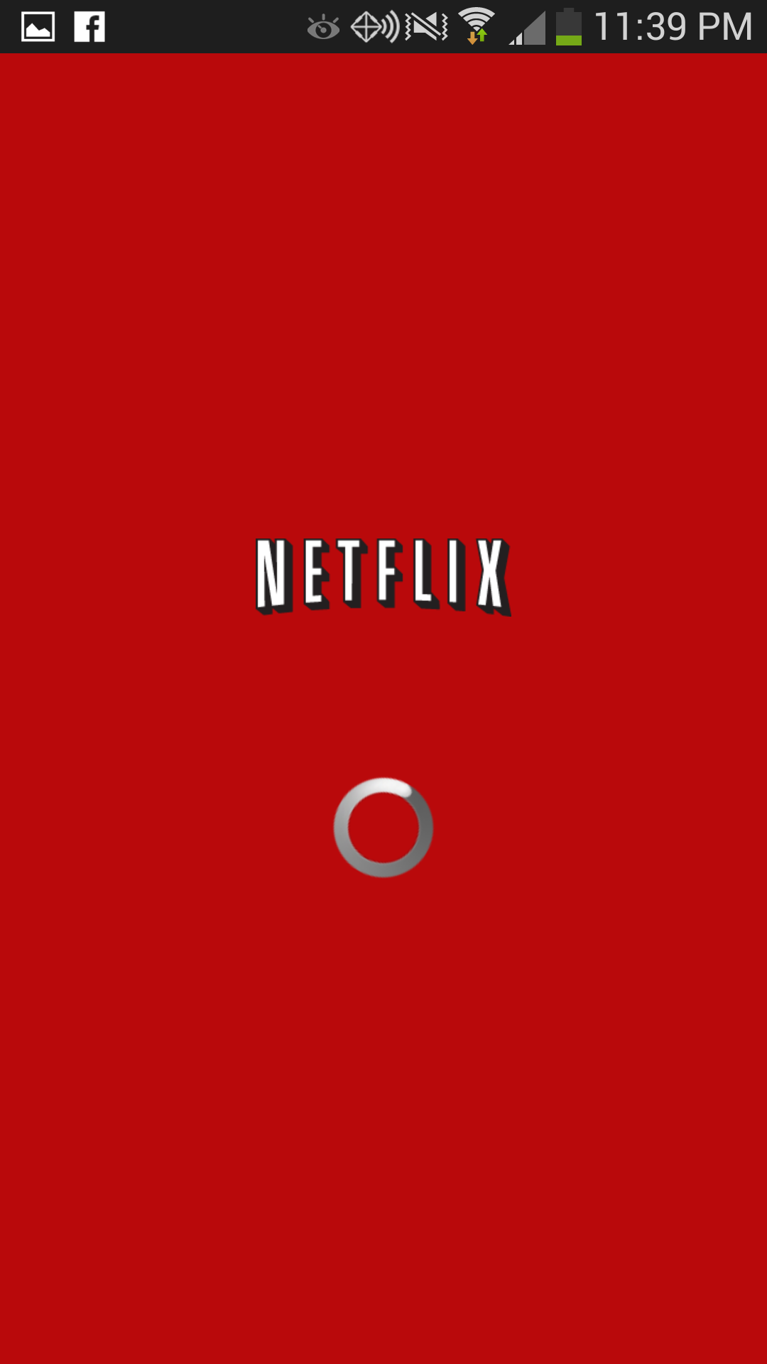
Connecting to Netflix is simple. They just have a branded load screen 
US Airways animates their logo to indicate processing


Summary
There are plenty of different things you can do to keep the user on your site or in your app while something loads. As always, balance the business needs (revenue from advertisement, cross promotion, etc.) against user fatigue and interest and promoting your brand. Wherever possible try to reduce load times altogether.