Progressive Disclosure
When designing something with a lot of information that the user may not need to know all at once, you need progressive disclosure. Actually, progressive disclosure is woven into the nature of the internet and many applications. Users see something and decide they want more information about it, or to see things related to it. So they “zoom in.”
Commonly, this takes the form of clicking a “more” link. Other times it could be an accordion or some sort of other expanding and collapsing control. Progressive disclosure also includes things like tool tips and info boxes. The idea is that the app allows the user to indicate that they are interested in learning more about something by some sort of input—generally a click or a tap.
Common Methods
Content Toggles and accordions
Content toggles allow the user to click or hover on a heading to expand and collapse information. This is most common on control panels and dashboard-type views. Sometimes this method takes the form of a tree view as well, but we’ll group that all into the same category. If using content toggles or accordions in your UX design, avoid using hover to expand/collapse and consider allowing multiple sections to be open at once.
-
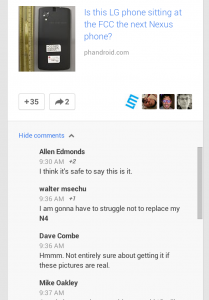
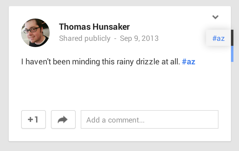
Click the comments link to show comments on Google Plus -
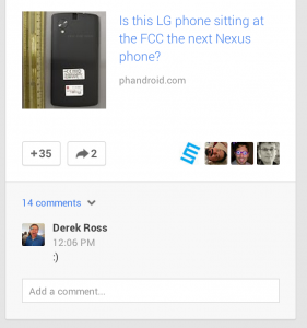
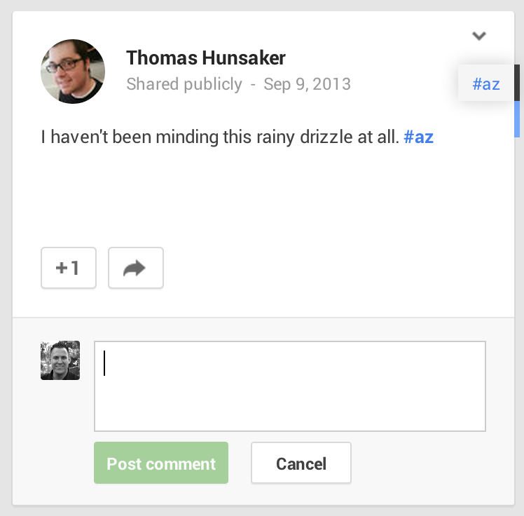
Click the comments link to show comments on Google Plus -
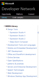
The MSDN web site uses a tree view for progressive disclosure UX -
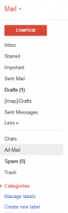
Gmail uses a "more/less" toggle that slides more email categories out and back. -
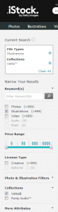
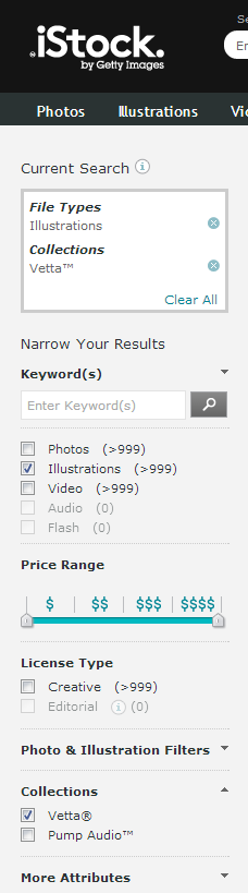
Istock uses little triangles to show where there are more controls


Peek a Boo
Peek a Boo content can take many shapes. Sometimes, it’s a tooltip that appears on rollover, and other times its an instructional overlay. This can be an engaging way of connecting users to your content, or bringing more information at exactly the time when it is most relevant.
-
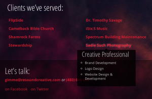
Resound Creative uses tooltips to describe their projects -
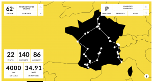
100 Ans De Tour requires a click to launch an overlay -
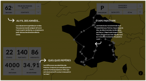
100 Ans de tour Info overlay -
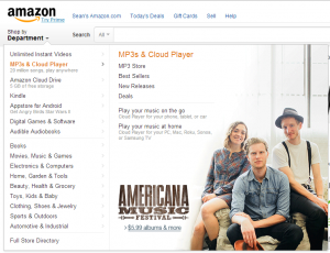
Amazon has whole content areas that switch out on rollover -

Amazon Prime has a "tooltip" with a sales pitch -

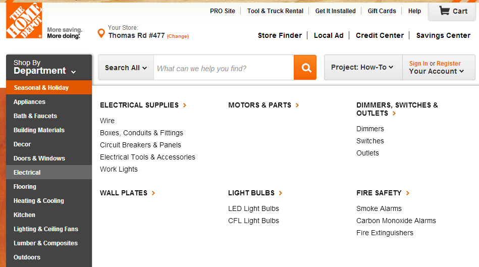
To drill down into Home Depot’s categories, you can use their department dropdown.


Drilling Down
Countless apps use a drill-down methodology for progressive disclosure. Often, this the first step is a list of things. The user then selects one, and may get some details about their selection on a separate screen, and sometimes another list of finer details to drill down into. This is very much like the “zoom” idea described above. Unlike the others, it drilling down requires multiple pages or views. One could browse a series of encyclopedia articles this way: World > Country > State > City > Neighborhood > House > Room, and so forth.
These are easy to come by on just about any ecommerce site or any reports-based site. Think Google analytics or mint.com. If you have a lot of complicated data that spans a wide area of topics to zoom into, this may be the way to go.
Iconography of Progressive Disclosure
I found some different patterns for how to indicate that clicking on something provides more information about what was clicked on
Plus and Minus
Most common in tree views, some applications use a plus or a minus to indicate clicking will hide (minus) or show (plus) additional information.
Triangles
The orientation of a triangle may indicate what will happen when you click or the state of a content box. Triangle use was inconsistent. Sometimes the closed state had the triangle pointing to the right. Other times it either pointed in the direction the content would go if it was clicked, or it indicated the state of it. So, up or down pointing triangles don’t have a standard use.
I think (but admittedly have no data) that if you’re using a triangle, the simplest way is to have it point in the direction that content will move: down if it will slide down, right if it moves right, etc.
Right chevron
Right chevrons indicate that the user can tap to go to a more detailed screen. Generally, it will slide the “viewport” over. But sometimes chevrons are used interchangeably with triangles
Interesting Approaches
Twitter does something really nice with their applications to progressively disclose available interactions. It starts with your feed. Each item has an “expand” link.
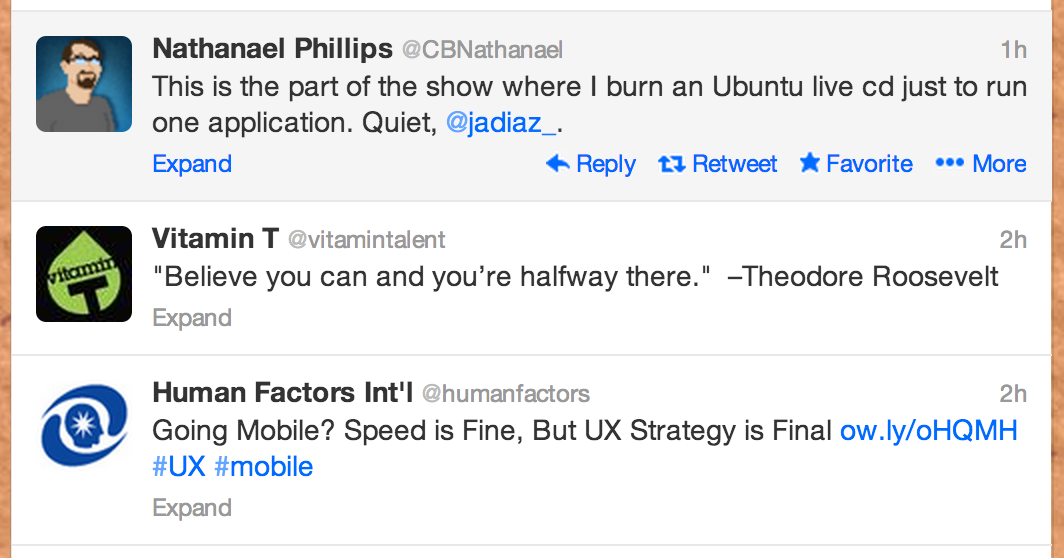
After clicking anywhere on the tweet, you get a full timestamp and a text area where you can compose a reply.
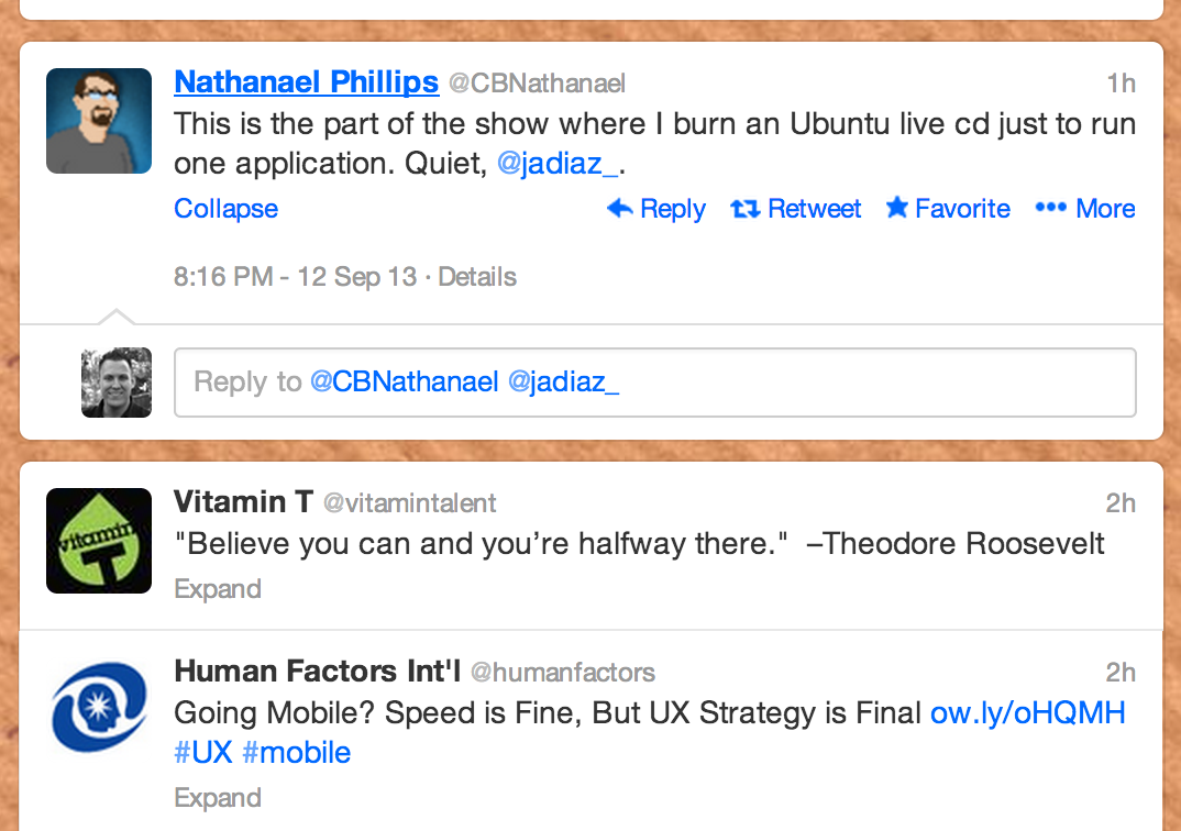
When you give the text field focus (by clicking on it), you get some options for uploading attachments and geotagging. you also get a count of how many characters remain in your tweet.
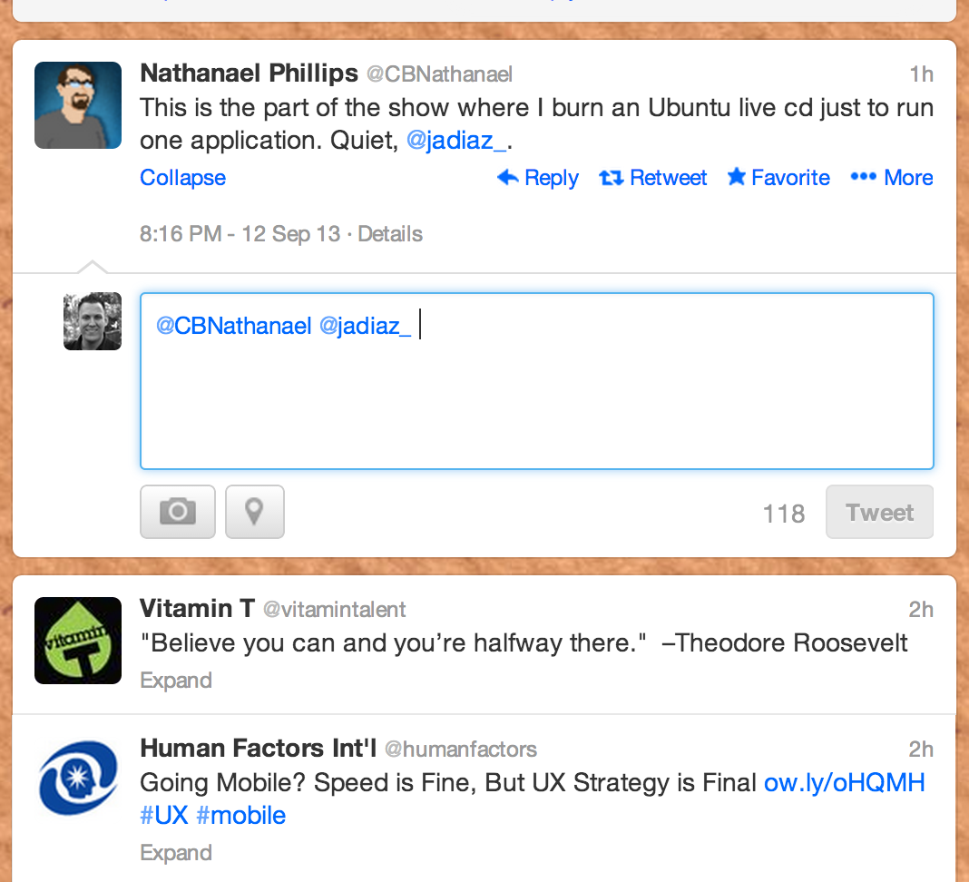
So, twitter progressively reveals more functionality as you interact with it.
Google Plus
Much like Twitter, Google Plus reveals more functionality as you interact.