New Credit Card Form UX Patterns
Credit card forms are necessary to take payment online. They are one of the last necessary steps to completing a purchase, so it’s very important to get it right!
These last few years, there have been several popular innovations in credit card form design. Most involve some sort of automatic detection of the credit card type based on the first few numbers (generally 1 or 2, but sometimes up to 6) on the card.
Traditional Credit Card Form
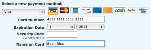
Traditionally, credit card forms involve little or no validation on the front end. Usually these rely on a simple digit count and perhaps some checksum validation on the server-side. Many times, traditional forms ask for the credit card type up front. This was originally probably a holdover from paper order forms that needed to be processed by hand instead of by computer algorithm. However, in some cases where there are a lot of diverse payment methods available, the type may still need to be selected in advance. In my survey, this pattern was on its way out.

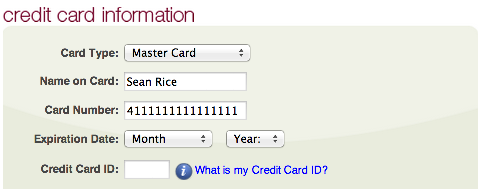
Kohl’s uses a simple form. They need the type selector because they have a store credit account you can use to pay. 
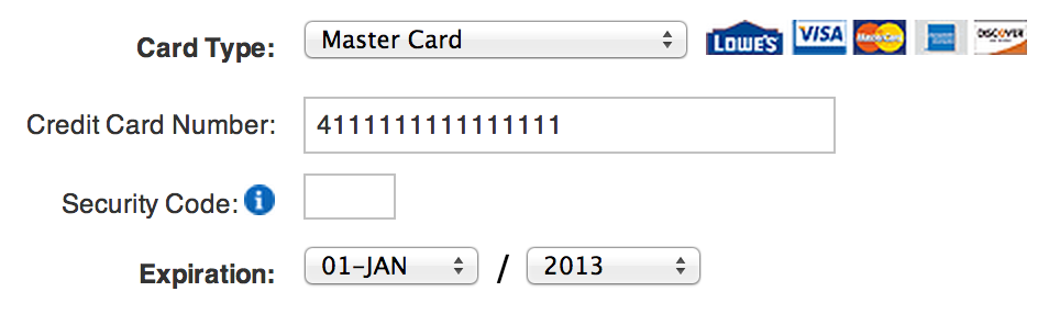
Lowes uses the traditional credit card from with no bells and whistles. 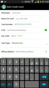
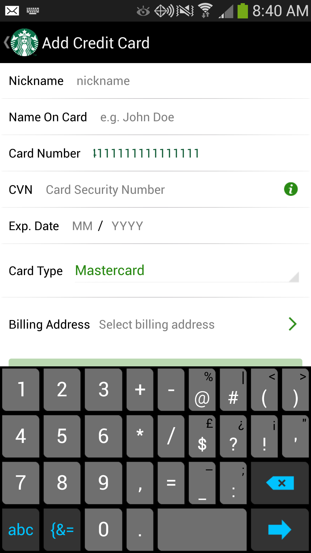
Starbucks Android App credit card form
Instant Validation
Instant credit card form validation evolved from the traditional credit card form. The credit card type dropdown is eliminated from the form, except where multiple payment methods are available. In some variations, valid card types are visible above or nearby the form. As the user types in their credit card number, the card type is highlighted or appears near the form to indicate that the user has typed in a valid number, and they can verify the card type as a second step. In cases where the payment type is still selectable, entering the number for a different card type than was selected causes the type to change to match the entered number. This was the most popular UX pattern in my survey.
For a development (jQuery) example. see https://jquerycreditcardvalidator.com/
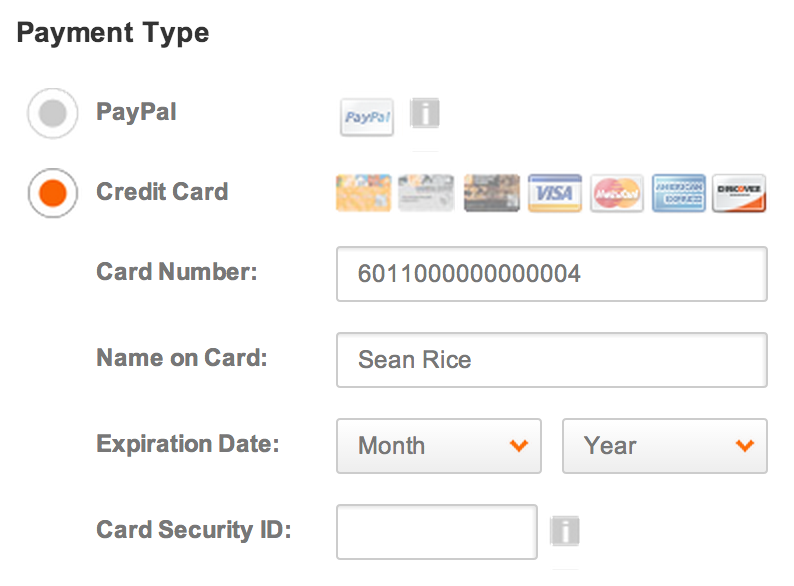
Walmart's payment form has several available methods. If one is selected incorrectly, it automatically selects the correct one. Numbers are grouped automatically as well. 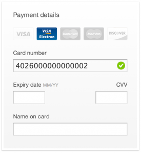
jQuery Credit Card Validator demo 
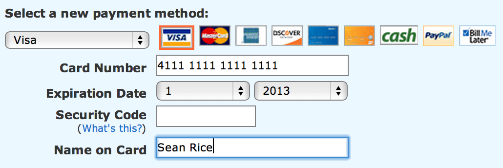
Amazon.com displays the available types to the left. Once a valid number is entered the type appears next to the input field. 
Home Depot uses the instant card validation UX pattern. 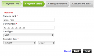
Godaddy autoselects the card type from the dropdown. 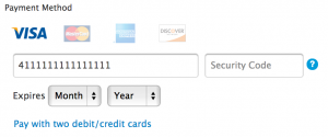
Apple uses the instant validation UX pattern on their credit card form.


Skeuocard
A recent more recent pattern is called Skeuocard. This method adds a lot of layers of validation. It groups the numbers on the card properly (many cards are 4 sets of four numbers, whereas others like American Express use alternate number groupings. It also assists with the card security code in the instance that the CSC is on the front of the card. Skeuocard relies on a layout that appears like a credit card (this is called “skeuomorphism”) which is its charm, but also its downfall.
Some work may need to be done to provide the proper affordances that the numbers on the card graphic are editable as this is not immediately evident when the form does not have focus. However, in a really progressive design, this option could be a good fit provided the skeuomorphic nature of this UX pattern works with the overall design. I have never seen this pattern in use on a production site. If you have, please comment below so I can mention it!
Give Skeuocard a try at https://kenkeiter.com/skeuocard/

Blank Skeuocard form UX pattern 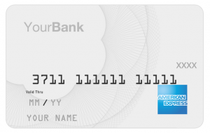
American express Skeuocard pattern. 
Skeuocard with a visa card number UX pattern


A Note on Expiration Dates
It is a best practice to match the format of the card—generally, MM/YY—with your form elements. I do not know if there is a clear winner between dropdowns versus textboxes for credit card expiration dates.
Summary
The Baymard Institute (E-Commerce Checkout Usability Report 2010 – Guideline #63) recommends using some sort of inline credit card type validation, but at the very least, it recommends removing the selection for credit card type, since its extraneous.
Further Reading
Detailed information about how credit card numbers break down on Wikipedia: Bank Card Number