UX Patterns for Adding To Cart
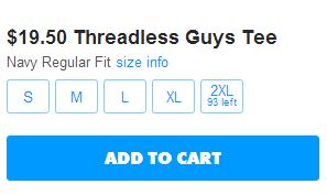
Any time a customer wants to buy something, they need to add it to their cart. But what happens when the user clicks that magical button? I sought out several options and have laid them out for you. Most of the sites I checked used one of two strategies for confirming something was added to the shopping cart.
Keep Customers on the Page
Usually paired up with some related items the customer could buy, I found most online retailers used some sort of inline confirmation that something was added to the cart. Often, this was an overlay of some sort, but Walmart stands out here for actually moving the page content down to make way for a confirmation message and related products.
This helps the user retain the knowledge of where they are in the site and encourages additional purchases.
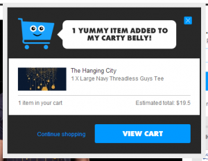
Threadless has a cute cart character and a confirmation overlay 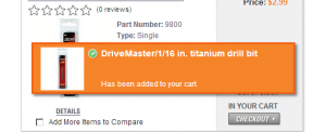
Autozone uses s simple confirmation message 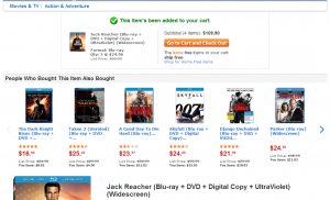
On the product detail page, Walmart pushes the details down to make way for confirmation and related items. 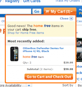
On a product list page, Walmart drops the cart down when something is added to it. 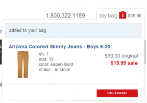
JCP causes their cart to drop down when something is added. 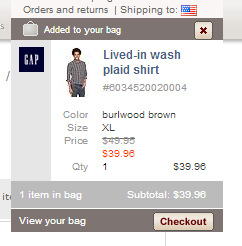
Gap uses a dropdown cart that appears when something is added. 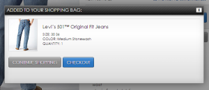
Dillards shows us its shopping cart in a modal with too much empty space. 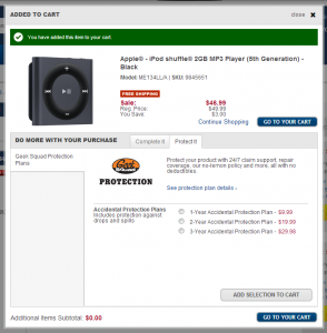
Bestbuy gives a confirmation overlay with some add-on products. 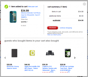
Target handles adding to cart with a confirmation and related items in an overlay. 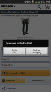
Amazon.Com's mobile app keeps it simple. 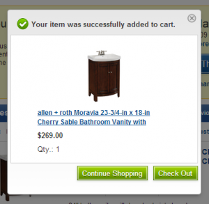
Lowes gives us a simple add to cart overlay 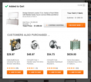
Home Depot has an add-to-cart dialog packed with related items.
Straight to Cart
A second option in wide use is to take the user straight to the cart page after adding to cart. This may decrease abandonment rates (anyone have data to back this up?), but takes the user out of the context of shopping for items and places them at the checkout. If they intend to buy more than one item, they may have to retrace their steps a little.
This option may work well if your site sells expensive items or your customers typically only buy one item at a time.
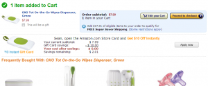
Amazon drops users straight into their cart, but related items are everywhere. 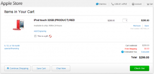
Apple sends customers straight to the cart 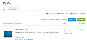
Dell, after making users run a gauntlet of upsells, mercifully drops users on the cart page 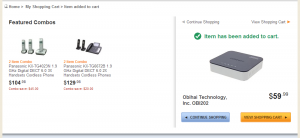
Newegg drops the user on a confirmation page for upselling. 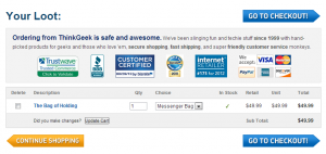
Think Geek plops people who added to cart on the cart page.
Breaking the mold
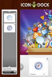
A couple of patterns are out there that are different than the standard UX designs above. Firstly, Amazon.com pioneered (and patented) one-click purchases which allow you to skip the cart altogether, provided you already have an account set up for it. Also, icondock uses a drag-and drop cart that forgoes the add to cart button and everything with it in favor of a side box that acts like the cart. This works for them because of the simple nature of their products.
Summary
On sites selling fewer items, or higher-priced, but customized items, it may make sense to just kick the user straight to the cart/checkout page, in an attempt to avoid cart abandonment. However, as we see on sites with a larger breadth of items, perhaps a one-item purchase isn’t as desirable, so upselling must take place to increase average order value at the risk of higher abandonment rates.
