Designing builder tool ecosystems in layers
As a user journeys through our family of applications at Keap, they traverse many layers of functionality that they are probably unaware of as they move. In order to design a cohesive experience, we designers need to visualize the different layers of our app and plan for ways to help our users transition between them seamlessly.
That starts with knowing and mapping your layers. From there, you can more easily understand and communicate about the features that exist at each layer and how a user can move between different layers to access those features.
Defining the layers
When I started at Keap in 2017, they already had a fairly mature set of functionality. The web app was powerful, but complex with lots of interdependent parts. One of the reasons for comparatively poor engagement at the time was that our more novice users had difficulty finding the key features they would need to become successful. Simple, general-purpose features like email sending were made more complicated because design and automation features were combined into the same tool. Other pieces of functionality that should have been standalone couldn’t be accessed at all outside the confines of an automated workflow (called a campaign);
We needed to clarify what the layers were in our application.
For Keap, here’s what our layers look like:
- Design system
- App
- Meta builders
- Builders
- Content editors
Design system and App layers
These are the layers that our users only know as “Keap.” We have several apps, and a handful of interchangeable themes within our design system. Each app may even have its own design system that generally inherits from the main one. This is what makes them separate layers. I will expound on these ideas elsewhere, but abstracting the design system layer out of the app layer helps Keap make better software while the user is for the most part unaware of them.
Meta builders
As the user navigates through our apps they encounter ways to set up or automate various things. The simplest one of these to explain is how users may create and send a broadcast email. You set up the subject line, recipients, and AB test settings in what I like to call a meta builder. This could take the form of a wizard or automation tool, or even an API call.
For an email broadcast, it’s important to note that the email message and design template itself are not what get setup in a meta builder. A meta builder should provide a smooth transition to a builder experience. In the email example, it makes sense that once a subject and other metadata are set up, the user should be able to pick and edit their email templates. This is where the user traverses to the builder layer.
Builders
Builders are about assembling blocks of content, imagery, and other things that are created or otherwise modified in content editors. Builders make enduring and reusable artifacts like email templates and landing pages. Artifacts made in builders shouldn’t belong to meta builders, but they can be referenced in them.
Content editors
Content editors allow users to create rich text, code, or upload and modify images. If you’re composing an email or cropping and recoloring an image you’re using a content editor. Content editors don’t only live on their own, but within the context of other layers. Users traverse to this layer briefly to make a change and snap out just as quickly when they’re done.
Why layers?
I needed a way to describe how the builders interact with our app. This also gave me a way to conceptualize making some pieces of our app—the builders and meta builders—interchangeable. Thirdly, grouping these functions this way allows us to point out redundancies and determine what to do about them.
To use email as an example again, we were able to determine that we had 3 separate email builders in our app. More correctly, we had 2 builders and one content editor all being used to send email. When we looked at all the content editors in the app, we found that there were a handful of them that behaved slightly differently. Looking at our application this way helps our teams to trim and combine in ways that will make our application more consistent, simple. and simultaneously more powerful.
A journey involving layer traversal
In an app, users traverse layers all the time without really knowing about it. Let’s walk through a typical interaction in our app. This time, I’ll use automation building as an example. Here’s a diagram:
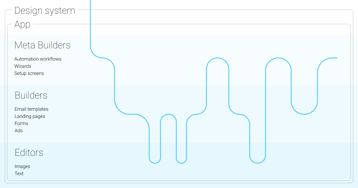
- The user enters the application and decides they want to set up a landing page that sends an email template when the page visitor submits a form.
- They enter the automation builder, which is a meta builder to see how everything connects.
- They then go to create their landing page, traversing to the builder layer.
- In the course of editing their landing page, they need to upload and edit images as well as enter some content. They traverse to the content editor layer several times and back out.
- Once they’re done with their landing page, they go back to the meta builder layer and and connect an email template.
- The user creates and edits the template in a builder plunging to a content editor briefly.
- Again, the user ascends to the meta builder layer to connect another follow up email template.
- Since the user had already created this email template, they simply check it over in the builder but don’t do any content editing.
- Lastly, the user backs out to the meta builder again to launch their automation.
Conclusion
At Keap, we’ve found it helpful to map the layers in our app because it has given us insight into ways to continually improve. Have you mapped your app in a similar way? What insights did you find?