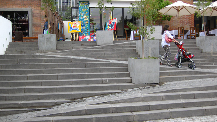
In Defense of Staircases

Designing for a world of differently-abled devices
We’ve come a long way since Ethan Marcotte coined the term “responsive design” in 2010. Most web sites can be pulled up without so much as a thought from the glass rectangles we keep in our pockets. Many of them adapt nicely to fit the smaller screens. Of late, I’ve been hearing an old idea re-emerge in new ways in regards to web design. The idea sounds like this:
Make the experience exactly the same across all devices.
This article will take that idea and look at it through the lens of accessibility in architecture.
For a point of reference, let’s look at a few different ways to solve the problem of traversing floors in a multi-story building.
Stairs
Stairs are the enemy of wheelchairs and walkers, of canes and strollers. Yet they can be found in nearly every building, even if only in sets of two or three. Stairs are difficult and often painful to climb for an extended period of time. Not many people climb stairs for fun.
Stairs are efficient. They allow people to quickly traverse floors without electricity. Stairs can support hundreds of people simultaneously moving up or down them.
Stairs are durable. The need very little upkeep in order to perform safely year after year. If built well, they can last centuries.
Ramps
Ramps are accessible to all. Everyone can move up or down a ramp safely. That’s the point!
Ramps also require no electricity and can generally support hundreds of people at the same time. However, traversing a ramp may take longer than stairs because of the horizontal distance a person has to move back and forth to travel upward. This makes them less efficient than stairs.
Like stairs, ramps also need very little ongoing maintenance. One needs only to clean them periodically and repair the occasional crack.
Elevators
Elevators work for everyone as well. They’re very easy to use, as the user does no work at all to traverse floors.
Elevators need electricity to run. Only a few people can ride an elevator at a time, making them inefficient.
The problem with mechanical solutions is that they need constant upkeep. Parts need regular maintenance and replacement from time to time. A down elevator is a frustration to many.
Escalators
Escalators have many of the problems of both stairs and elevators. they’re efficient in that they can carry many people quickly and effortlessly between floors, but they also have a tendency to fail from time to time because of their mechanical nature. Regardless, people in wheelchairs, using walkers, or pushing strollers may not be able to user them.
Ramp-staircases
The obvious solution may seem like combining a ramp and a staircase together. The advantages here are clear. People can walk, roll, glide, or push between floors in the way that works best for them. There’s little upkeep and energy use compared to the mechanical options.
Take a closer look. In the image, a wheelchair user would need to turn back and forth every 10 or so feet which would be quote troublesome and time consuming. Steps cut out at strange angles, which may cause people to trip. In the article cover picture, the ramps are too narrow for most wheelchairs, defeating their purpose, and likely adding hazard to an otherwise unremarkable architecture feature.
What this means
Web designers need to be flexible and look at the problems and the people individually when building a solution. Sometimes we have to let go of rigid principles to meet the needs of the users—all of the users. Many times, that requires making special accommodations for the different devices they have.
That means embracing the unique features of the user and their devices as an opportunity to serve up an exemplary experience.
Sometimes, an exemplary experience is like that ramp-staircase mix. Other times, it’s more like an escalator and an elevator.
In any case, the right solution requires understanding. What good is an escalator when power is unavailable? Why should a user stand on an escalator for 100 floors? Should 1,000 users have to wait for a single elevator because the building designer didn’t add stairs?
The bottom line
Ensuring all users can use your app is the baseline. Everyone deserves a great experience no matter their abilities or device choice, desktop or mobile. So take advantage of the special features each device has.