Heuristic #10: Error Handling
Error handling is the last in the list of My 10 Heuristics. It’s also usually the last thing to get designed, many times as an afterthought to the rest of the design. This should not be! Error is so much a part of the Human Experience and so much a part of our experiences with software, that we should plan around a significant occurrence of it in our interfaces, even as we build interfaces that help users avoid errors altogether.
Error states
Input incorrect
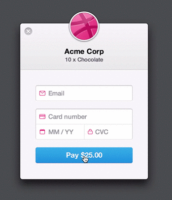
This error state occurs often around login screens. A user mistypes their username or password and the system has to alert them to their mistake. Usually this notification involves highlighting the offending field with a message like "The username or password you entered is invalid." Incorrect input also happens when the user leaves fields blank or enters an invalid credit card number.
Savvy designers have made this experience more human using a shake animation instead of just adding error text. Something like this may not be appropriate for all situations, but it adds an element of fun to lessen the impact of the mistake.
Input out of acceptable range
When entering in numerical data, it’s simple to build the limits into the input fields. However, even this can have unintended consequences. For example, a telephone number may be entered into a field with dashes, parentheses and even letters to denote an extension. Limiting the amount of characters (numbers) users can put into this field may result in the input getting truncated, frustrating the user.
Some tools exist that allow for automatic formatting of phone number inputs. Use discretion when implementing them as sometimes they make it difficult to edit the phone number after inputting it.
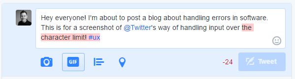
Other inputs such as the message field for twitter handle input outside of the acceptable range well. They inform the user that the user is over the allotted character limit, but let them continue typing while they formulate their message. Twitter has even implemented ways to give users more available characters by using link shorteners and attaching images differently.
Input type mismatch
When input is in the form of letters and numbers, it is fairly easy to limit the types of characters that are available to the user. If your field doesn’t support underscores, don’t let the user enter them! To limit confusion, tell them near the form which characters are not permitted.
In other cases, a user may need to enter several identifiers. Best practice here would be to try to detect the number the user is entering in and let them correct the error. Something like this might solve the problem “It looks like you’re trying to enter in a driver’s license number. This field takes a VIN which looks like this:” and show an example.
Accidental click
Accidental clicks are more common on mobile as the way users interact with it through gestures can be easily misunderstood. My favorite example of this is a reading app I use often. As I read, I like to hold my finger on the screen and scroll slowly. The app detects this as a “long press” which causes it to highlight the sentence I was touching, while bringing up a set of controls that I have to dismiss before continuing to read.
The best way to help users avoid this type of “accident” is to detect the issue in user testing or analytics and program or design around it.
Another type of “accidental click” involves accidentally submitting a form or a part of a form. Help people avoid this by making button text clear, and explaining what will happen when they submit, especially if they are at the end of a longer process. Also, give the user the ability to “undo” or go back whenever possible.
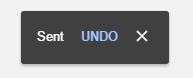
Google Inbox does a good job with this, allowing the user to "undo" a recently sent email for a few seconds after clicking "send"
Connection interruption
As the internet becomes more widely available just about everywhere, users forget about how often the connection drops, or services become unavailable. When this occurs, you may be able to fake it for a few seconds while things load up. When you upload a photo to instagram, it shows up in your gallery immediately, even though it may not have uploaded to the web yet.
In cases where this is not possible or prudent, try to show the user that they are offline, and where possible give them the chance to continue working and save progress locally until the connection is restored.
To limit the impact of interrupted or slow connections:
- Compress media
- Implement caching and load-balancing on your web services
- Give users the ability to do some things offline
Error Prevention
Jakob Nielsen states in his article 10 Usability Heuristics for User Interface Design, "Even better than good error messages is a careful design which prevents a problem from occurring in the first place." Well-designed and well-executed user experiences prevent the user from making errors in several different ways.
Correct mistakes for the user
When your system can reasonably ascertain what the user was trying to do, simply correct the error for them. Be sure to give them a way to undo the correction though. Spelling checkers that work as-you-type are a good example of this in action.
When your system require things in a specific format (e.g. with or without dashes or in all caps), help the user by automatically formatting their input for them either within the UI or behind-the-scenes.
Limit inputs to acceptable values
If your system only supports numbers between 1 and 100, don’t let the user enter Zero or 101. Tell them when they encounter the issue. Something simple like briefly highlighting the field so it catches their attention ought to do it.
Enable easy recovery from error states
Back buttons, undo features, and allowing the user to edit any of their input after-the-fact can make things much easier on them. One frustrating thing I’ve encountered is when I can’t change my username after setting up my account. This is especially troublesome if I misspelled it the first time.
Avoid imprecise input methods
The apple touch bar on the new Macbooks comes to mind here. I can’t imagine trying to scrub video timelines to a specific frame, or selecting a specific color using my finger. Still, touch interfaces can be precise enough, but they need special treatment to help the user get the exact setting they need. One good example of this is how iPhones use the zoom-in feature to drop the cursor in a text field if you long press.
Wrapping up
I just provided you with several examples of possible error states and ways to help users avoid them, or understand what happened when they trip over one. There are many more possible errors a user can make than are listed here. Also, there are many more ways to solve for these errors.
To uncover what is happening in your application, observe a few users within your app, or dive into form analytics data to see what your users are tripping on. Take your newfound user empathy and design a better solution.
Iterate, test, repeat!
More from this series
This is the final post in the series, My 10 Heuristics. Check out the rest of the posts!