Heuristic #3: Awareness
When I audit the awareness of an experience, I’m looking at how the experience adapts to the user. Any time a web site asks for information, that information should be used to benefit the user. Any data the web site can gather on the user with or without their knowledge should be used to make the experience better.
What I look for
Location
Location finders are typically minefields for awareness issues. A site may ask for a user’s geolocation. I have come across many sites that don’t react well when the user denies geolocation. In my experience, these are a couple possible outcomes:
- Default the site around a location that could be very far from the user’s actual location.
- Display features for users who have set a preferred location, but throw errors when the user (who has not allowed geolocation) tries to interact with them.
Our studies have shown very low use of geolocation features when the user is prompted by the browser when they first enter the site. There are three more effective ways to get this information:
(Recommended) Look up the user’s location using their IP address

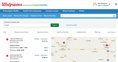
Let’s face it, your web site (apps don’t have this problem) doesn’t need to know where a user is within 3 feet. IP address lookup can get you close enough—within a city block or so—to find your nearest locations to them, and they can fine-tune from there. You also don’t need to prompt them for this. A good example of this is Walgreens’ location finder.
Prompt when the user interacts
A “use my location” button gets the user in the mindset of sharing their information. They’ll be more likely to follow through and allow the location sharing feature if they asked for it in the first place.
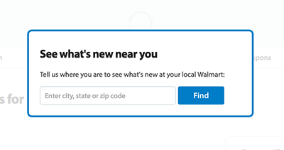
Ask them for their location

The old standby option is to simply ask them for their location. If you do this, make sure you only ask them once, and save the information until the user indicates that they want to change it. Users don’t like being nagged over and over again for information they’ve already provided.
Device

Sites and apps know which devices I’m using. It’s part of how the internet works and how apps are built. A user browsing the web on a Google Nexus Tablet shouldn’t be prompted to download apps from the IOS app store, and vice-versa.
Logged-in Experience
If a user has created an account, tailor the experience towards them. Ask one or two questions during the account creation process that will help. One way to get low awareness scores is to serve exactly the same experience to users who create an account as those who don’t have one. Users love little details like personalized greetings, or defaulted order options based on their previous orders.
Social
If a user logs in with their social media account, they expect their account creation on your system to be seamless and to pull in their profile information such as their avatar, name, and even address and phone number. They don’t like having to enter information they’ve already shared with you through another means.
Summary
In short, awareness means your site or app should consume the data available to it in order to make the experience completely seamless to your users. Ask for the information you need, and don’t pester the user to re-enter information they’ve already shared.
Stay tuned!
Next week, I’ll post a detailed look at Heuristic #4: Wayfinding from My 10 Heuristics.