Heuristic #7: Affordance
We covered this briefly in Heuristic #5: Interactivity, but we’re about to dive a bit deeper into affordance. In short, affordance is the way of letting a user know how to interact with something successfully by the way it is designed.
UX people like to talk about doors when they talk about affordance. That’s because they read chapter 4 of The Design of Everyday Things by Donald A. Norman, which uses door handles as a classic and approachable example of affordance. Who hasn’t run into a door with that they pulled, when they should have pushed? The design of something ought to tell the user how to use it, and not necessarily rely on explicit help text (which often gets ignored) to direct people through an experience.
Affordance is also designing something that enables users to easily use it. Generally, this applies to the "hit area" of interactive elements. The accepted rule is 40px x 40px minimum size for interactive areas.
Clickable things
Anything clickable on the screen needs to appear clickable. And by its appearance show that other things are not clickable. Users love to click. They click on images, links, colored boxes, buttons, colored text, headlines, and just about anything that doesn’t look like plain text. The simplest way to make something appear clickable is to make it stand out from other things around it by color, size, or a graphic.
Positive and negative actions
Clicking a button is about taking action. Buttons need to clearly tell the user what they are about to do when clicking them. Often, there are several available actions a user can take.
A user may be presented with "close" and "continue" as options. In this case, the buttons should have different styling based on application-wide conventions to indicate the positive action is "continue."
Other times, the options may be "back" and "delete". In this case, the delete option should be marked as destructive in some way to give the user pause before clicking it.
Buttons should be
- Clearly labeled based on context
- Designed to stand out as buttons
- Big enough to click (40px X 40px minimum)
- Styled based on the type of action being taken
Draggable things
Some elements look draggable by nature, or are known to be draggable by operating system convention. On desktop devices, icons in a grid similar to a file browser or desktop background are draggable. On IOS, when the home screen is in its configuration mode, the icons jiggle.
In a list or grid interface, to make something appear draggable, give it arrow icons, or a "grippy" icon or some other graphical treatment to help the user know they can drag the item around.
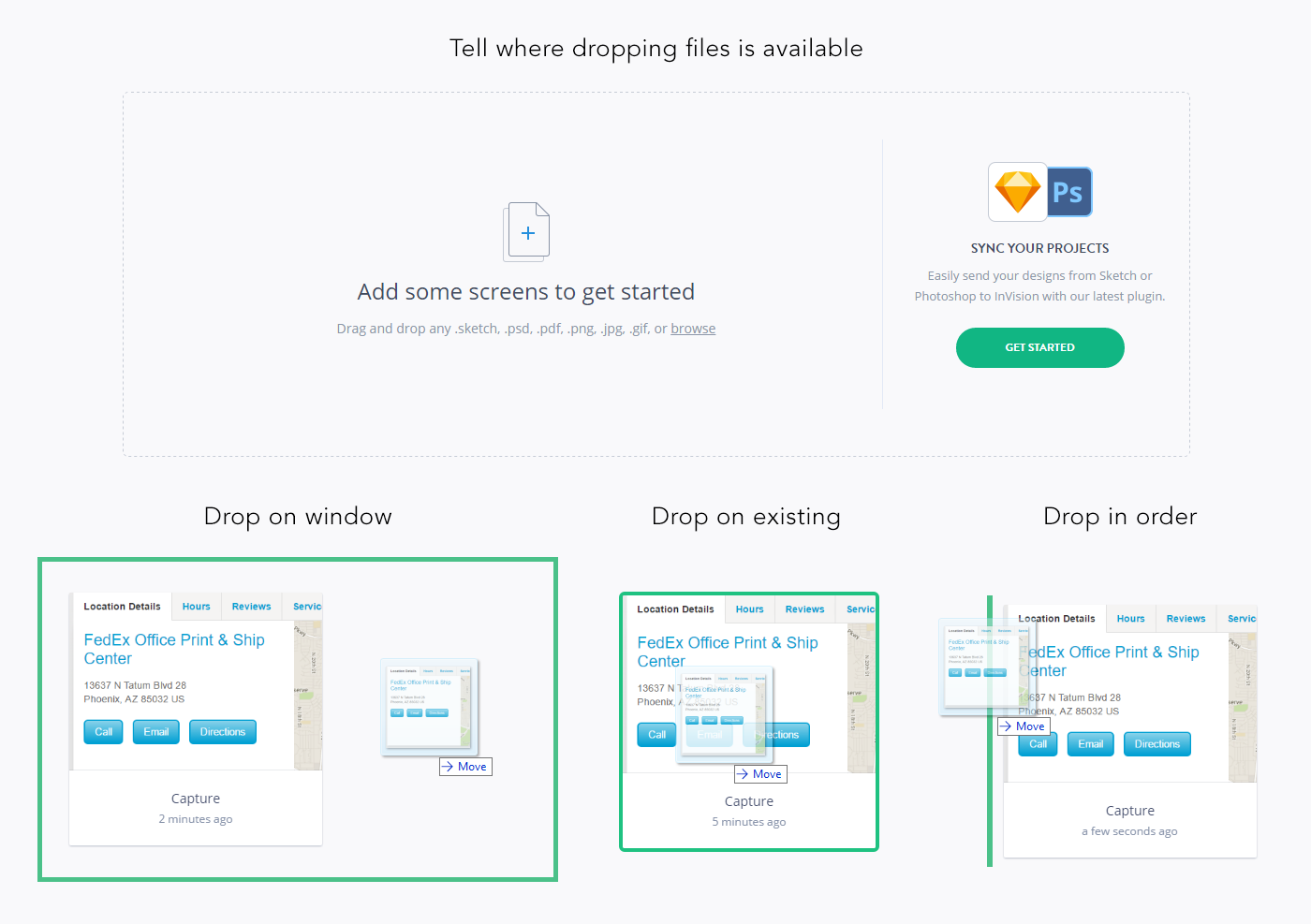
Dropping
When dragging something that can be dropped in a container, it is important to tell the user where they can drop something. Invision, Pictured below, shows not only where files can be dropped, but hints at how dragging and dropping onto different areas affects the application behavior.
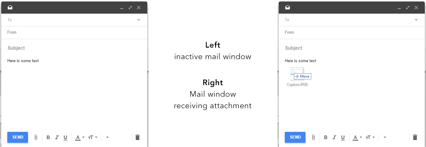
Contrast that with how Google Inbox doesn’t seem to know something is being dropped on it at all.
Swipes
Showing that the user may swipe across an area to interact can be done several ways. I’ve covered this in more detail in another article I wrote entitled Affording Horizontal Swipes on Touchscreens. In short, here are a few ways to tell users they can swipe:
- Crop content on the left or right, allowing it to peek out from the edges of the screen
- Show progress dots above or below to indicate paging
- Show arrows on the right and left
- Display an animation of a user’s finger sliding across the screen
Conclusion
There are lots of different ways to give users affordances about ways to interact with your site or app. Some will be more successful than others depending on your users’ needs. Unless you’re Snapchat, don’t rely on users stumbling through your UI to figure out how to use it. Help them out, and everyone will be much happier and more willing to come back!
Stay tuned!
Next, I’ll post a detailed look at Heuristic #8: Simplicity from My 10 Heuristics.