The User Experience Design of Address Forms
If you’ve ever worked on a site that needs to process payments or mail something out to a physical address, you’ve encountered address forms. Like many things in user experience design, they are something easily overlooked. You can just go with whatever is built in to your ecommerce platform, or roll your own simple form. This post covers some innovations in address form design that show us that perhaps these forms need special attention.
Why address forms matter
For ecommerce, consider that every person going through your conversion funnel must eventually complete an address form at least once in order to make it possible for you to process payment.
Basic address form
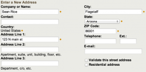
Amazon has a basic address form with no bells & whistles If the system you are designing has anything to do with logistics planning or customer management, your users may need to complete these forms multiple times a day. Consider the need for accuracy and speed when entering unfamiliar city and street names like “Truth or Consequences” or “Albuquerque”.
With all that in mind, here is an inventory and analysis of ux trends for address forms
Wording
Your typical address form will have form fields for the following items:
- Company name – Generally optional if it appears at all
- Address - Sometimes called “Street address” or “Street number”
- Address line 2 – Almost always optional
- Suite number - Usually optional
- City
- State
- Zip/postal code
- Since the zip/postal code wording appears often together, it would be interesting to see if US users experience confusion if we removed “zip” and just called it a “postal code” which is a more generic term.
International considerations
I have found when operating globally, it is easy for users to get mixed up in forms that don’t ask specifically for the terms they are familiar with. Particularly, they seem to struggle with City, State, and Zip code wording. In non-US countries, these may be called other things like prefecture, department, territory, province, township, ward, and postal code. Be sure that you localize your form labels to your target geographic area. If you cover a wide variety of areas with the same form, test and find something that works in all of them.
Best practice: If you can reasonably surmise the country the user is coming from (or shipping to), by a selection made earlier, IP address lookup, or asking them outright, change the form labels dynamically. If you want to see a postal system with somewhat confusing addressing conventions, consider the People’s Republic of China. Users have to figure out how to map their national postal conventions to your form labels, so clarity is important.
Handling City, State, Zip code
The main difference I saw while surveying different sites was the way each site tried (or didn’t) to help the user select the proper combination of city, state, and zip code.
The traditional
Many sites fell back to dumb entry fields. Sometimes, state was in a dropdown selection control. This is the simplest way to do address forms that will work.
Having the state as a dropdown eliminates the problem of people not knowing the state abbreviation for the state they are entering. This is especially helpful for applications where users need to use this form on behalf of somebody else, like a customer service app. It also provides cleaner data than a text field, as it makes it impossible to misspell a state name.
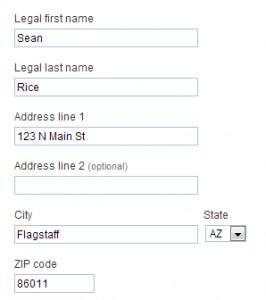
Paypal’s Address form is straightforward, except they specify that they need legal names. 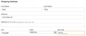
Newegg uses a traditional address form with some in-field Zip Code hinting that implies I must enter my full 9-digit zip. 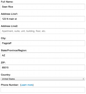
Amazon has a basic address form with no bells & whistles 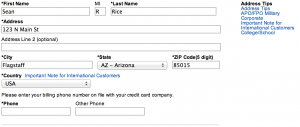
Best Buy’s address form design has no automatic features.
The Zip-o-Matic (Recommended!)
I saw a few sites (Apple and FedEx) make the user enter their zip code first, and then auto populate the city and state based on it. This saves a several keystrokes and should lessen spelling errors.
Some issues developing this
- Some zip codes have multiple cities/towns/etc within them. This means you need access to a database and the ability to get an array of cities from a zip code dynamically and allow the user to select them from a dropdown.
- You should also provide a way for someone to successfully complete this form without knowing their zip code. Your requirements may vary depending on the application. In their E-Commerce Checkout Usability Guide (2011), The Baymard Institute recommends using this method where technically and financially feasible.
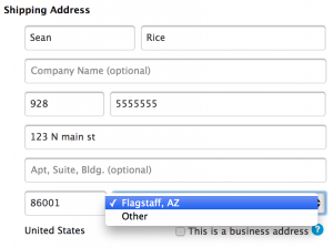
The address form for Fedex when the zip code has a single city. The dropdown button is non-functional. 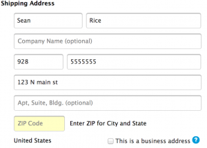
The address form Fedex uses when there are multiple options for one zip code. 
Here is what you see on the Apple address form before you enter in your zip code. 
Apple uses a dropdown form as well. Selecting “Other” shows a basic city, state, zip form
The suggestion box
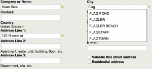
UPS uses an automatic suggestion dropdown as you type your city name. This may reduce errors as well, but still requires more keystrokes and more form field interactions than the Zip-O-Matic method. Developing this method requires a database of all possible city names, or perhaps just the most misspelled ones.
