Mobile Navigation Menus
Mobile navigation menu UX has been a hot topic the last few years. There are a couple of UX patterns that have emerged recently and some things that appear on their way out. For our purposes today, we’re talking about mobile navigation in terms of menus. Some apps and sites don’t use menus, opting instead for tabs or a home screen, etc., but we can cover those options in a later post.
The Menu Button
One of the primary parts of mobile navigation is the menu button. The design of it matters, as does its placement.
The Word Menu
Until recently, mobile navigation often contained the word “menu” to tell users that tapping would open up some kind of menu. This is much less common these days. I only found it in a few places. Also, typically this pattern is paired with a dropdown navigation that pushes the content down as it opens.
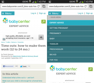
BabyCenter uses a dropdown triggered by a menu button. 
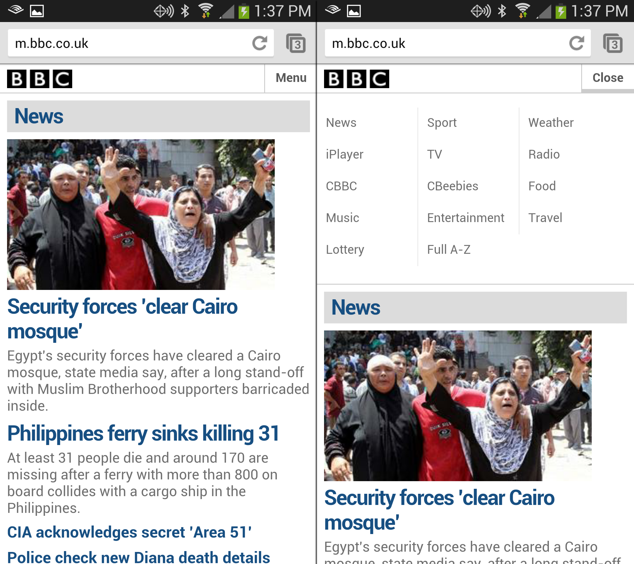
The BBC uses the word "menu" and the menu drops down. 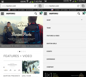
Burton used a standard select box for their menu up until a few weeks ago. 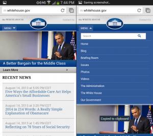
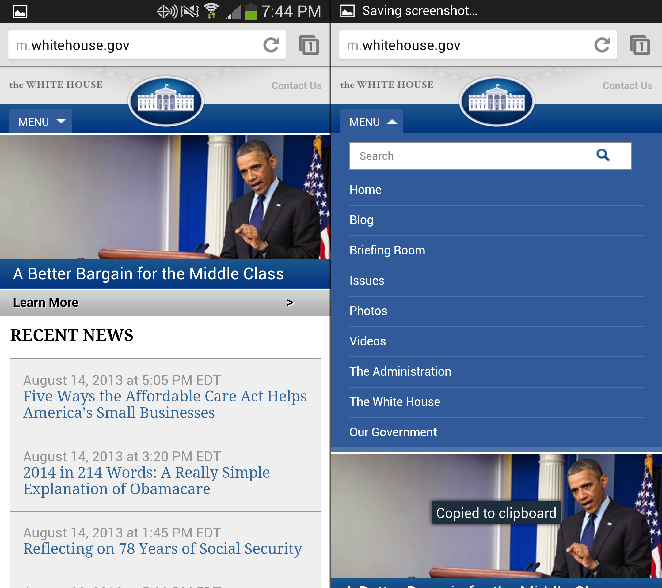
Whitehouse.gov uses the word menu paired up with a drop down.

Three Horizontal Lines ("Hamburger" Menu Icon)
Three Horizontal LinesProbably one of the most common patterns for a menu button is the use of three horizontal lines. This has become even more commonplace as frameworks like Twitter Bootstrap and Foundation are more widely used to launch responsive web applications. Curiously, I found this pattern to be most prevalent on IOS applications, even where Android applications use a different pattern. I dug into the IOS Human Interface Guidelines a bit, but didn’t find anything indicating a specific pattern for menu buttons was preferred over another.

Even YouTube uses a standard menu button on IOS. 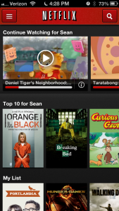
On IOS, Netflix uses a standard menu button 
Wunderlist on IOS Uses a standard 3 line menu button. 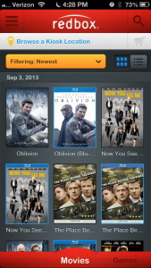
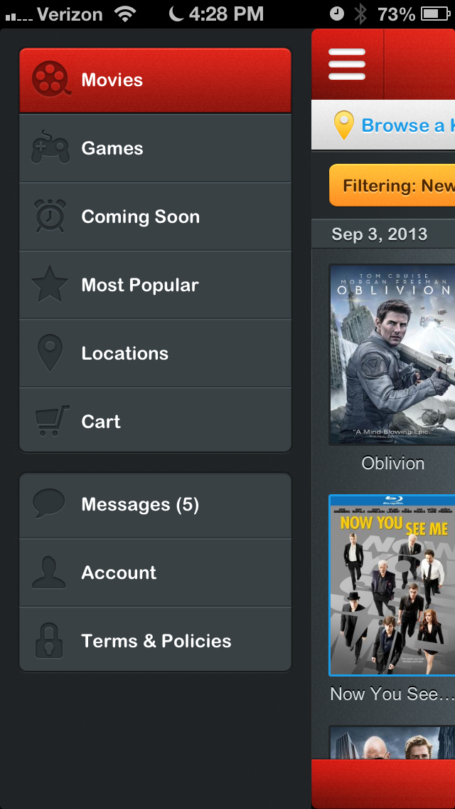
ON IOS, Redbox uses a menu button. 
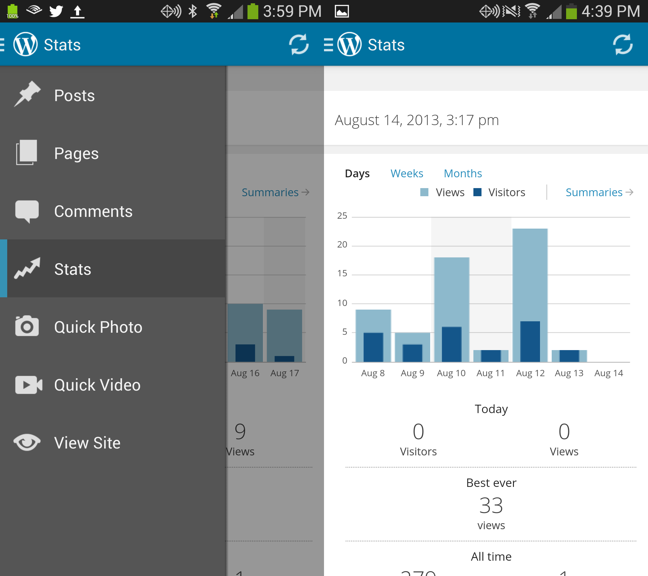
View of opened menu on IOS. 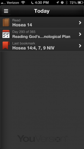
Youversion Bible App on IOS Menu Button


Three lines and a logo
In many newer apps and sites, particularly on Android, those three horizontal lines are married to a logo where they are now much thinner so as to give the logo prominence, but also to indicate a menu is one tap away.
Usually, when the menu was open, the three lines receded slightly to the left becoming even thinner.

Flixter 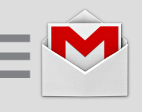
Gmail Menu 
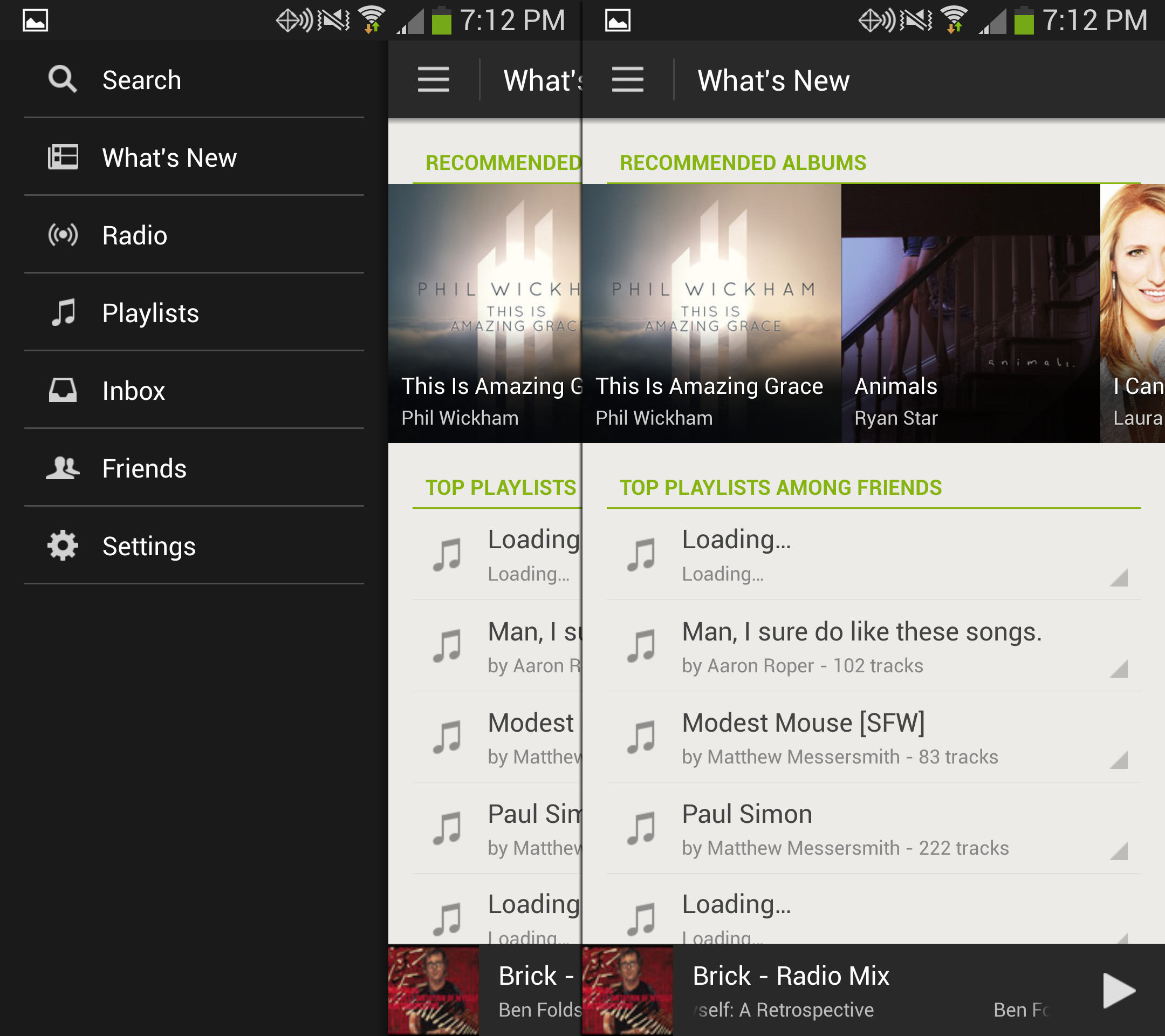
Google Play Music 
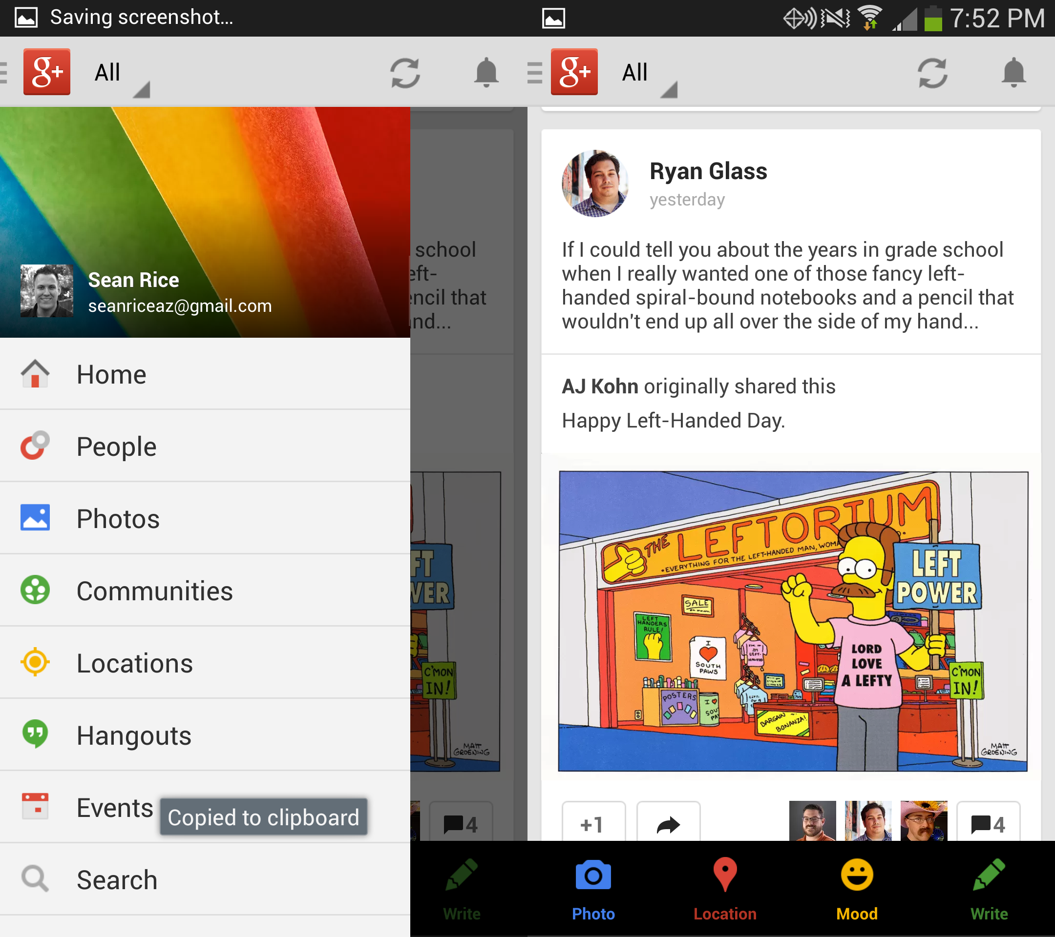
Google Plus 
LinkedIn Menu 
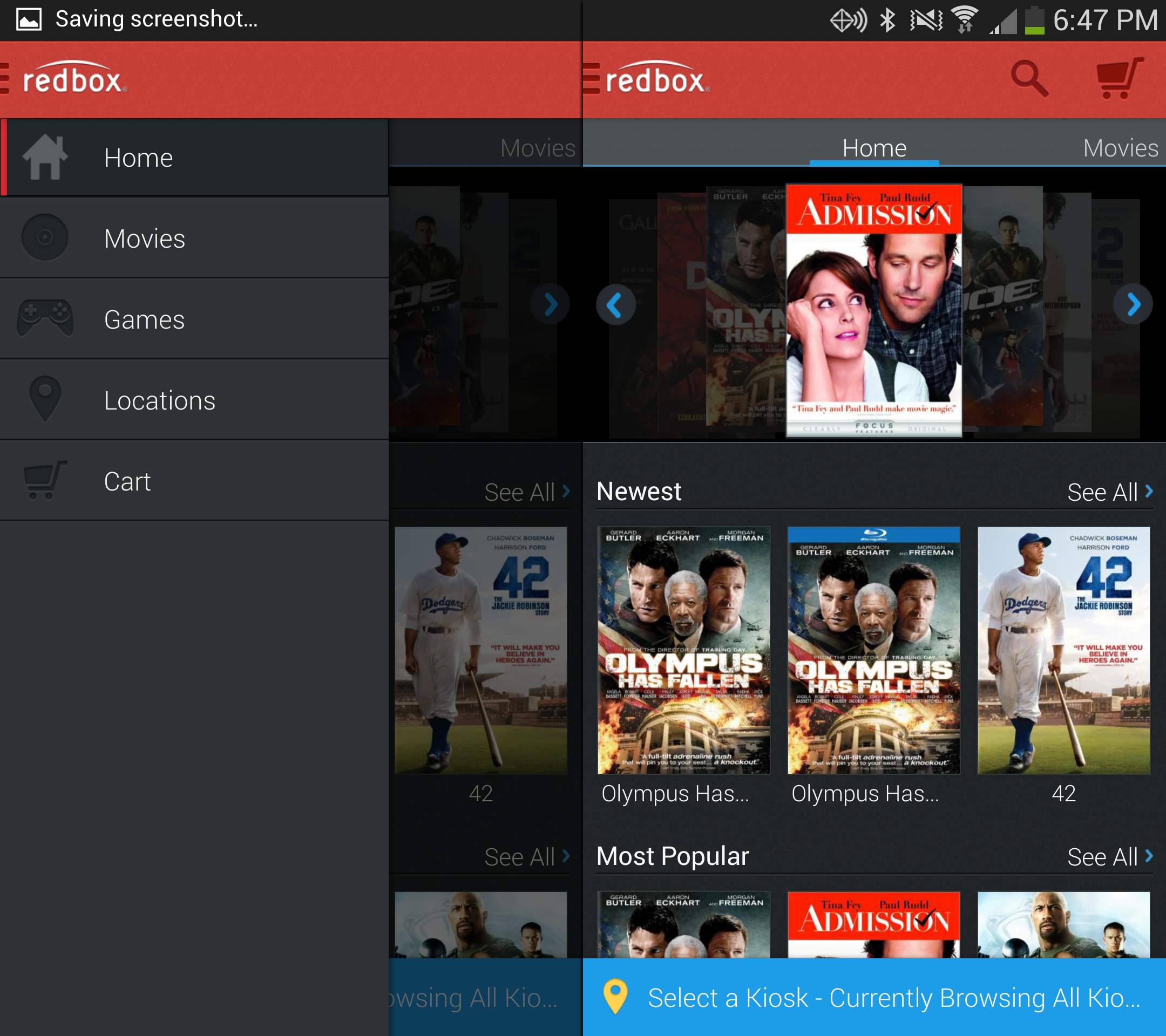
Redbox menu 
Simple App Menu
Button positioning
The menu button’s position is important too as it is indicative of what type of menu will appear and what type of movement to expect.
Menu Button on the Right
Early on, it was a common pattern to place the logo on the left and menu button on the right. This worked well because for right-handed people (most of the world–sorry southpaws!), this placed the menu within easy reach of their thumb, while giving the logo a traditionally prominent position. Also, in IOS, the left area was generally reserved for a back button.
A menu button on the right usually tells the user that the menu will slide in from the top, or from the right.

QQ’s menu comes in above with their menu icon on the right. 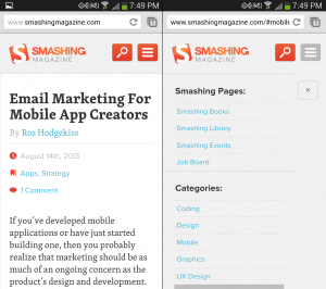
The Smashing menu drops in from the top 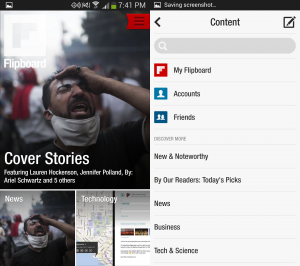
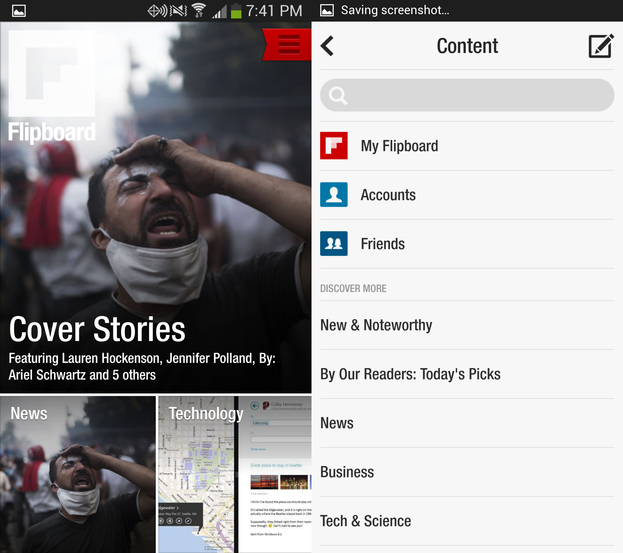
Flipboard’s menu slides in from the right.


Menu Button on the Left
At some point, the menu button started appearing on the left. This usually tells the user that the menu will slide in from the left. I found this to be the most popular option in newer apps, and on many web sites. This is almost always paired up with an off-canvas layout to the left that pushes the content over as the menu opens.
Flixter's menu slides in from the left. 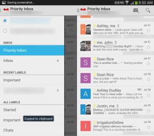
Gmail's menu comes in from the left with a darkened overlay. 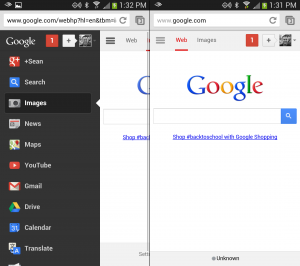
When logged in, this Google menu appears from the left. 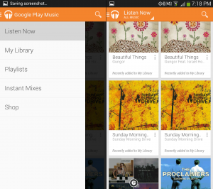
The Google Play Music app menu comes in from the left 
Google Plus's menu has an overlay and comes in from the left. 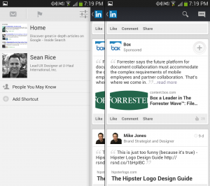
LinkedIn's menu slides in from the left. 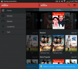
Redbox has a left menu 
Simple's menu slides from the left. 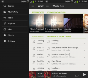
The menu in the Spotify app appears from the left. 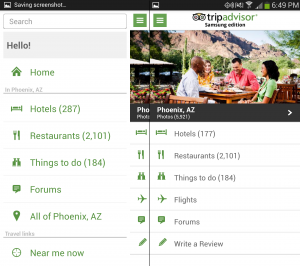
The Trip Advisor menu is on the left. 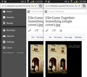
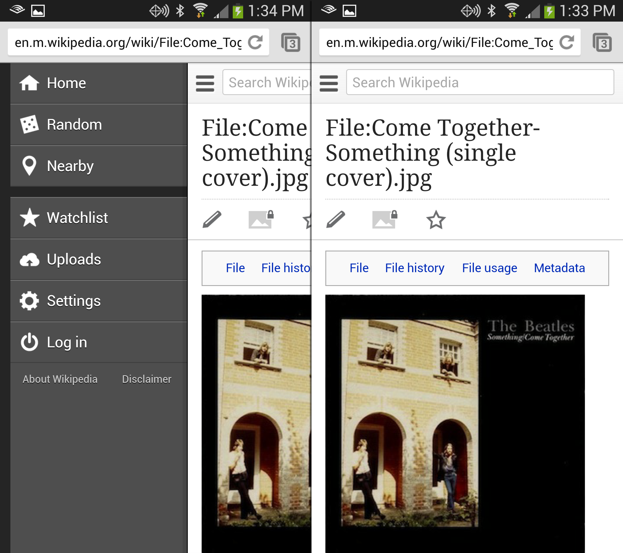
For Wikipedia, once you're in an article, there is a menu on the left. 
The Wordpress App has a menu on the left. 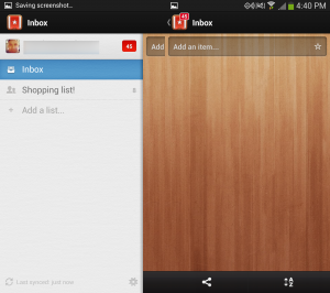
Wunderlist has a menu on the left that comes out like a drawer. 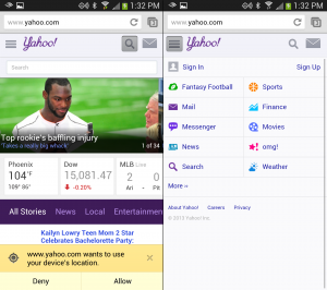
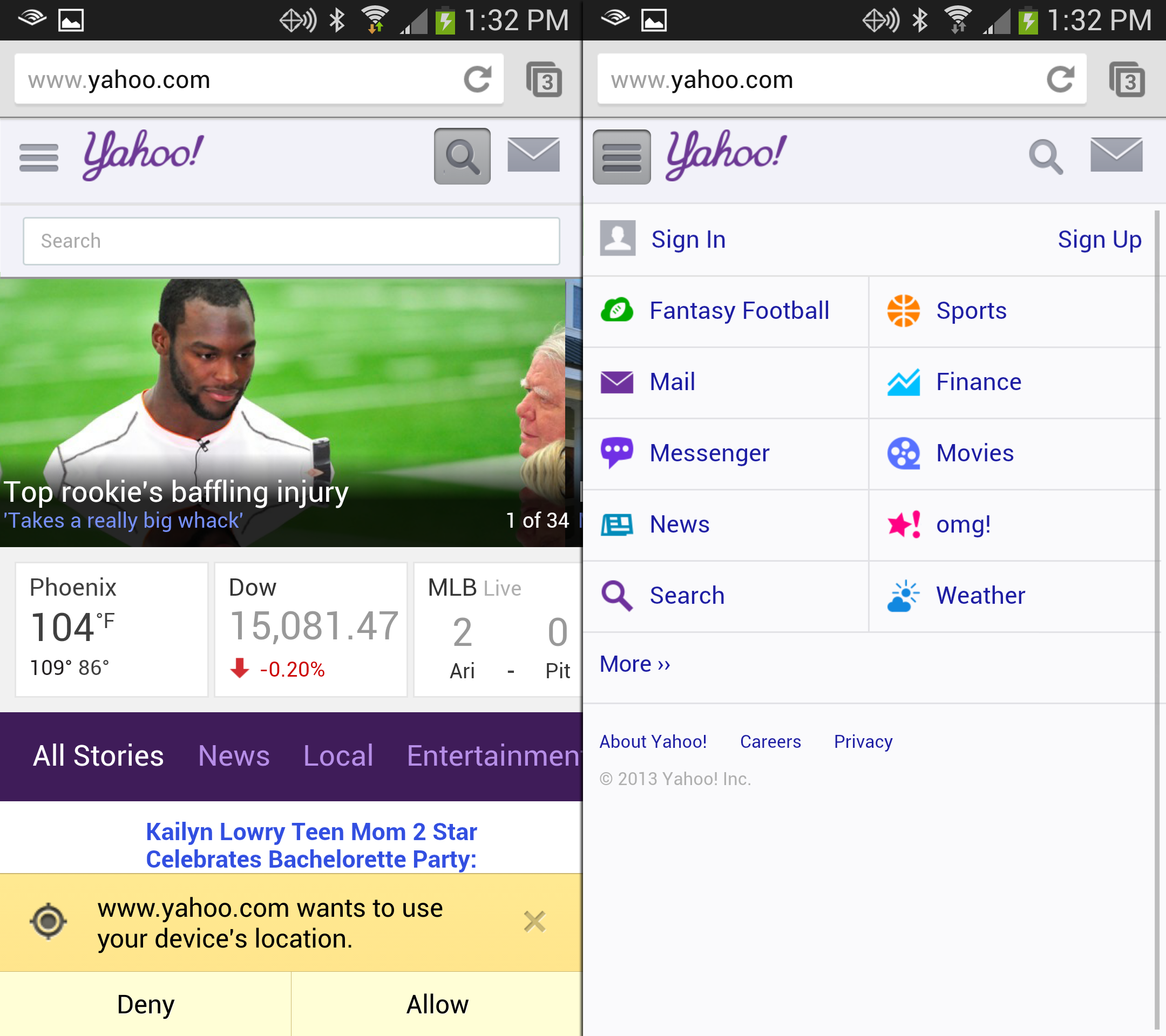
Yahoo (Currently testing alternate logos) has a menu that slides down over the content on the page. 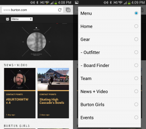
Burton's new menu drops in from the top.


Different Strokes
A few apps are doing different things with menus that you, my dear readers may want to pay attention to.
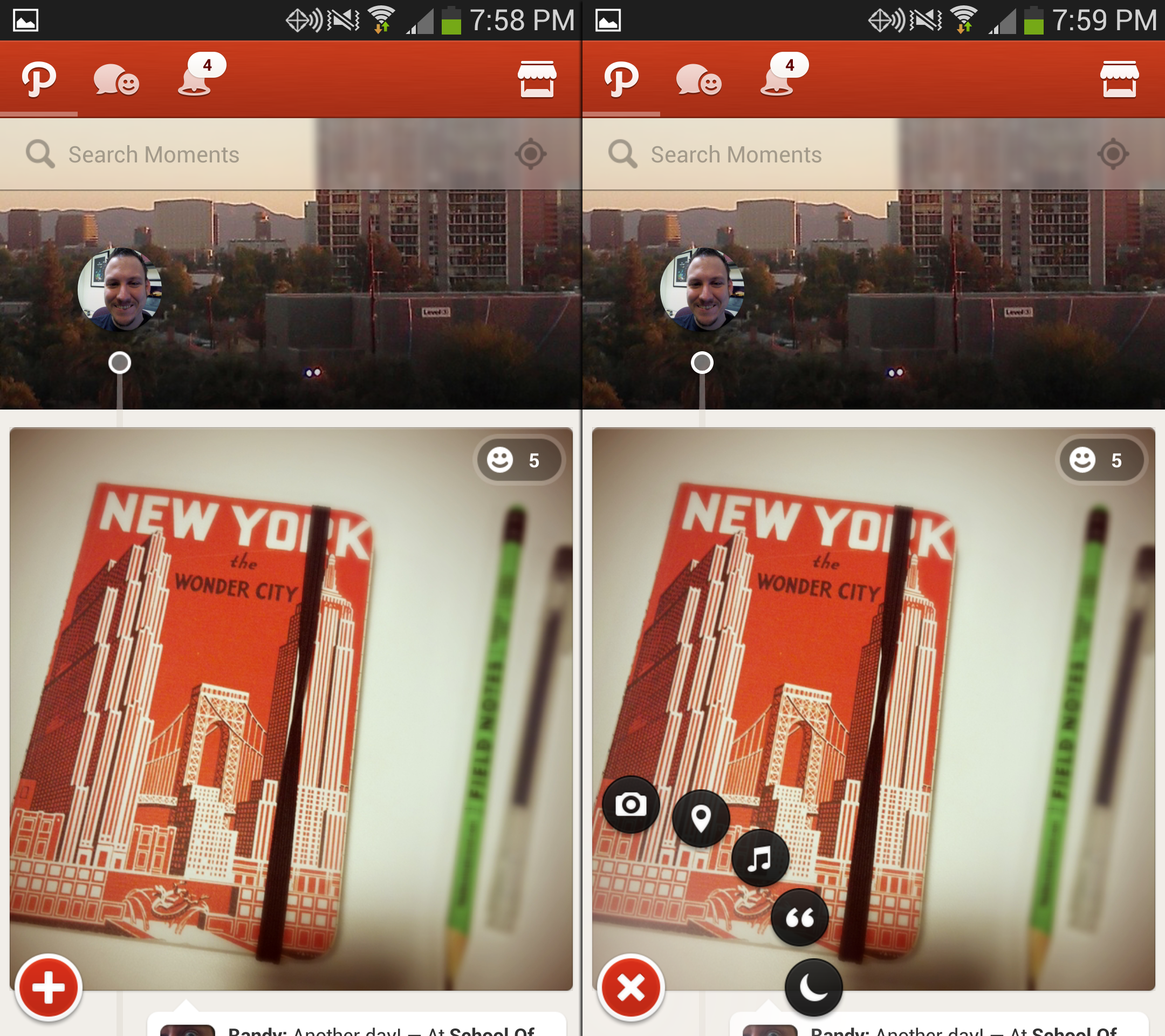
Path
When Path launched, it gained some notoriety for this feature. To post something, you tap their menu (a plus icon) and the items come out around it in a circle.
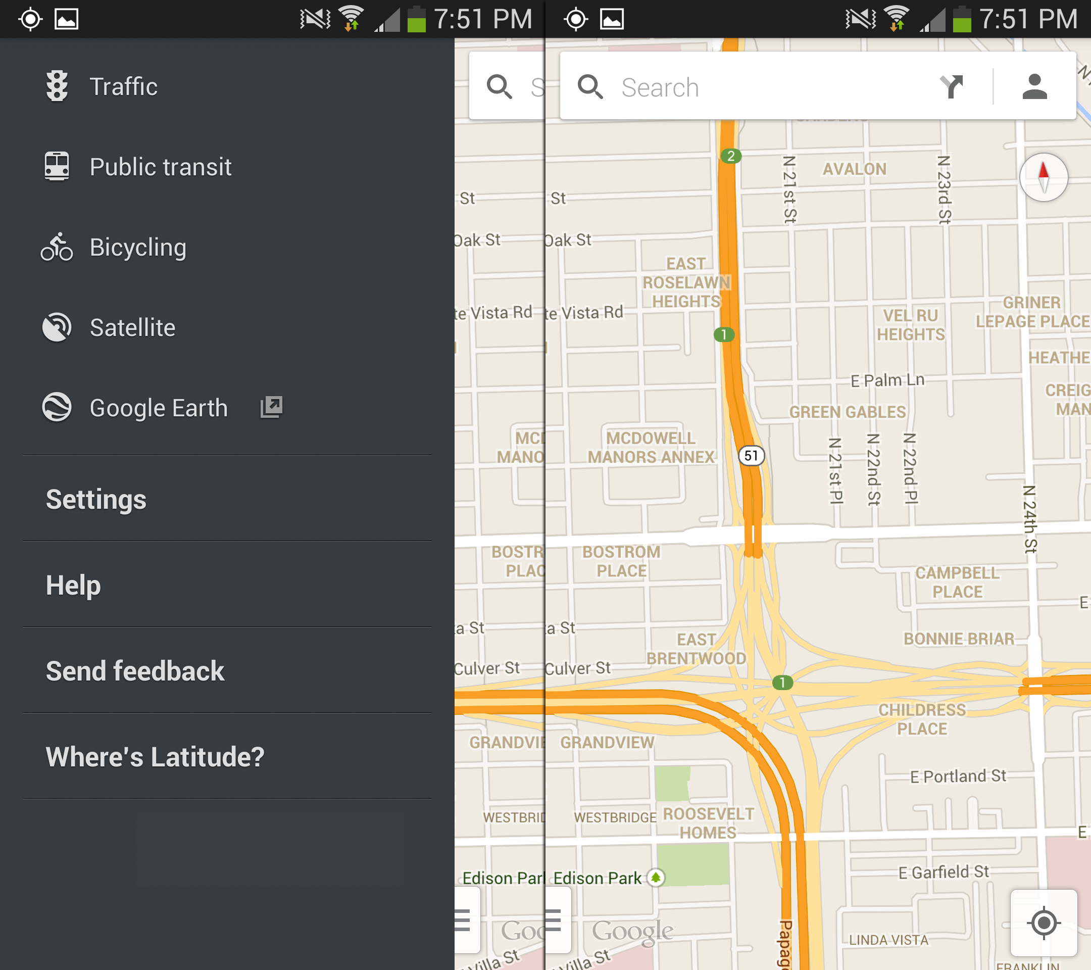
Google Maps
Google Maps (on Android) has moved their menu button to the lower left of the screen. This clears some room up top, but is otherwise a curious choice.
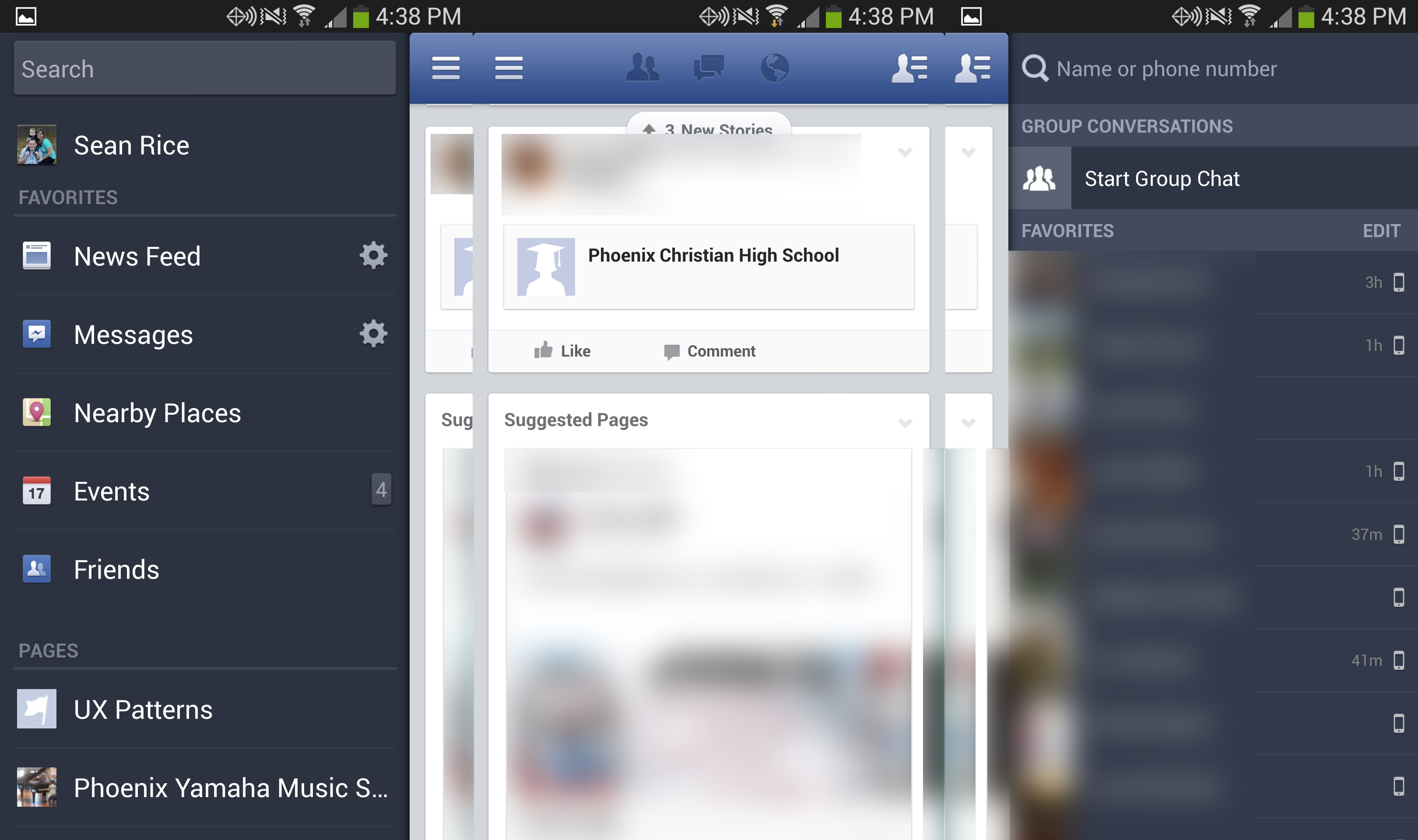
Facebook has two different menus that serve different functions. The left one is for navigation and other tools. The right one is for finding your friends
More reading
One of my favorite authors, Luke Wroblewski (@lukew), has written on some topics covered in this article: