Heuristic #4: Wayfinding
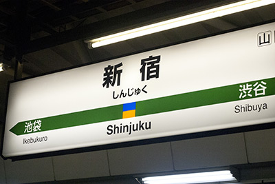
Ever been to an airport? A zoo? Perhaps a hospital? Or maybe you’ve driven on a highway (anywhere). Wayfinding in these contexts is typically related to signage throughout. A Mall has a directory with a map of the stores. A train station tells you what the next stops are in either direction.
Wayfinding in a digital context is largely the same. There are really only two concepts.
Tell the user where they are
Page titles
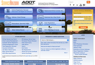
There are any number of ways to do this. The first thing I look for is a proper page title. Not only good for SEO if we’re looking at a web site, it’s also a necessity in helping the user know their location in an app—especially on a settings screen.
Navigation highlighting
On a web site, it’s conventional to highlight the navigation element representing their location in some way. This can be anything form a contrasting background color to an underline or even something as small as a dot.
However you do it, highlighting the active navigation helps people know where they are, which makes them more comfortable to navigate somewhere else.
Breadcrumbs
Breadcrumbs are helpful in telling the user the overall structure of the site. They show the current page and where it lives in the site map.
Help the user get where they’re going
In a hospital, arrows on the walls direct users where to find the pharmacy or the emergency department. On a web site, typically we have a navigation menu. Apps generally need something more in-context. Data shows that mobile web experiences benefit from the same in-context navigation cues.
The hamburger menu
Hamburger menus are a junk-drawer approach to site and app navigation. They’re not necessarily wrong to use, but they should only be a last-resort or a backup plan for better navigation patterns.
The hamburger menu is discussed at length by others, so I won’t get into the details here.
Obvious always Wins
Users navigate with whatever is available to them. As Luke Wroblewski Says, “Obvious always wins.” So, put important features right there on screen. Help the users navigate with appropriate content and imagery on the page—not only in navigation menus.
Navigation hierarchy
Larger sites need good hierarchy. This can be a difficult thing to put together. Here are a few tips for organizing your site architecture well.
- Use common language to group menu entries
- Primary navigation should be 2 or fewer levels deep
- Prioritize content around users’ needs
- Avoid similar-seeming categories
- Use tertiary navigation and search for deep content
What you need: a solid sitemap
Before you can really excel at wayfinding, you need to map and group your content and features in a sitemap. I won’t cover the details of these in this article. If your sitemap isn’t clear and simple, your users will have difficulty finding what they need and ultimately engaging with your company.
Stay tuned!
Next week, I’ll post a detailed look at Heuristic #5: Reactivity from My 10 Heuristics.