Typography is a lot like music
I’m a musician. I’m a designer. I see design and music in just about everything. I was looking for a way to describe a meaningful and systematic approach to type scaling. It surprised me—and at the same time, didn’t—that the solution was in my ears the whole time.
In this article, I’ll set up a scalable way of selecting type sizes, and then couple it with a system for pairing those sizes harmoniously in relationship to each other.
Type size scales and pitch scales
The mathematically-generated type scale concept is not new. There are a few different approaches, but ultimately, what you get is a set of type sizes that can be used in a design.
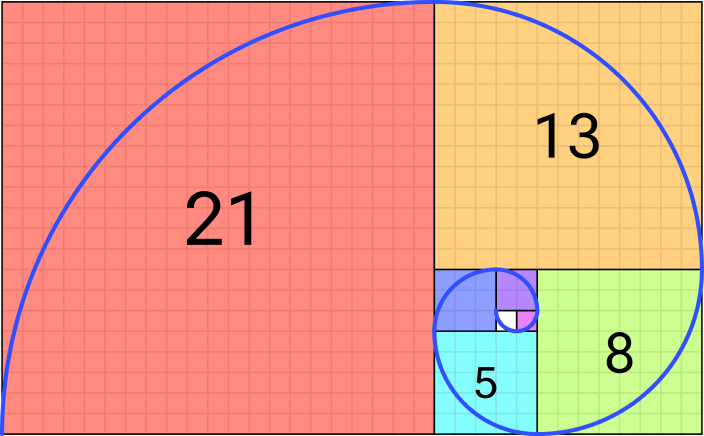
Nerds like me love automated systems because we can generate an infinite number of type sizes and justify why any of those sizes is acceptable. You can even use “classical” ratios like the Golden Mean, or the Fibonacci Sequence (a personal favorite of mine). After all, it was automatically generated by some algorithm, so it must be good design… right?
Even with the best algorithm, we’re only defining what’s avaliable to us in our design. We’ve defined an instrument. We haven’t yet made music with it.
Is music mathy?
Over the centuries, humans have made music in many different ways, with many different instruments. But how do you make music sound good? How do you make several instruments and voices work together to make an experience that’s generally regarded as beautiful?
On “beauty” and numerology
The concept pf “beauty” works for both audio and visual experiences. Over the centuries, people have sought to define “beauty” using mathematical patterns seemingly found in nature.
I’m not going to claim that beauty is something that can be achieved with a magic formula or ratio. Designers too often rely on classical ratios, numerology, sequences, and mathematical symmetry as if these somehow defend the beauty of the thing they created. I’ve done it. Some clients love to hear their logo was made out of golden rectangles, as if Leonardo Di Vinci himself would have designed it that way.
Mimicking nature or following classical proportions can give a certain feel to your work. But there’s no magic number that can make your work more perfect.
Humans like symmetry and pattern
While there’s no magic in the numbers and ratios we choose, we can observe that humans tend to prefer things that appear orderly. Our floors are often a grid or organized arrangement of similarly-sized squares or rectangles. We generally like musical lyrics and poetry that keep a rhythm and rhyme structure.
Common spacing, proportion, rhythm and repetition make for more beautiful visual and audible compositions. These are known as “gestalt” principles.
How do we create a typography system around these principles that’s repeatable, scalable, and more importantly, useful to the people tasked with implementing it?
Back to the music
Musical pitches also follow a pattern. In Western music, we have 12 notes. Each note corresponds to a specific frequency of vibration. Frequencies are measured in Hertz (Hz). A higher pitched note has a higher frequency in Hz than a lower pitched one.
In typical Western music, we tune the middle “A” note to 440 Hz. We say that the notes at 880 Hz and 220 Hz are also “A”. In music, these are called the “Octave” intervals. You can play all the A’s on a piano at the same time, and they will resonate in tune with each other and sound great.
Here is what one note played across 3 octaves sounds like:
Did you notice the mathematical proportions between those intervals? For every “octave” in music, the frequency of the note doubles (or halves, depending on which direction you’re going).
For centuries, musicians tuned their instruments to make the “major” intervals sound good in this way. If you play A, C#, E, and A an octave higher at the same time, you will have an “A Major” chord, that will sound traditionally harmonious. Those pitches correspond to these ratios:
| Pitch Name | Interval Ratio | Interval Name |
|---|---|---|
| A | 1 | Tonic or “Root” |
| C# | 1.25 | Major 3 |
| E | 1.5 | “Perfect” 5 |
| A | 2 | Octave |
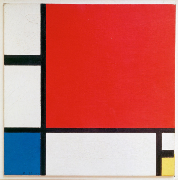
by Piet Mondrian
See the interval ratio pattern?
Every musician could agree that this set of intervals sounds great when played together. And mathematically, you can see why. But that’s only 4 notes. In art, that would be like limiting the color palette to 4 “pure” colors. Not everyone appreciates Piet Mondrian, who did exactly that. And even those that do would not likely call it expressive or capable of evoking a wide range of human emotion like music can.
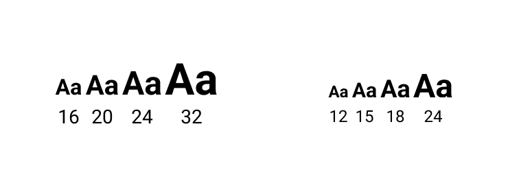
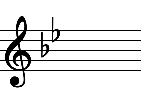
A type stack with these four intervals would look like have these sizes: 16px, 20px, 24px, 32px.
Or, starting from a “classical” 12 pt scale: 12, 15, 18, 24
That’s starting to look pretty similar to the type scale system referenced in this article by Spencer Mortensen. But we’re missing some “notes”.
Calculating the scale
Is a type system about the individual “notes”? If it is, how do we calculate the other 9 notes in the 12-note set?
Just Tuning
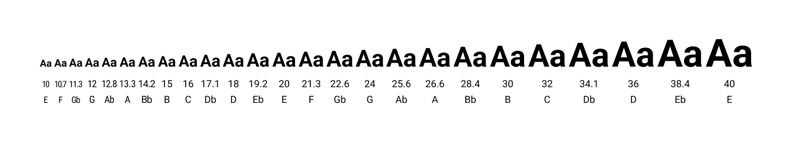
Believe it or not, for hundreds of years. musicians had several different approaches to tuning those intervals. The simplest was called “Just tuning” where all the ratios were calculated with whole numbers. Here are 12 notes using “just” tuning ratios:
| Note # | Ratio | Decimal | Interval Name | 16 Pixel Equivalent |
|---|---|---|---|---|
| 1 | 1 | 1 | Tonic or “Root” | 16 |
| 2 | 16:15 | 1.067 | Minor second | 17.067 |
| 3 | 9:8 | 1.125 | Major Second | 18 |
| 4 | 6:5 | 1.2 | Minor Third | 19.2 |
| 5 | 5:4 | 1.25 | Major Third | 20 |
| 6 | 4:3 | 1.333 | “Perfect” Fourth | 21.33 |
| 7 | 64:45 | 1.422 | “Augmented” Fourth | 22.76 |
| 8 | 3:2 | 1.5 | “Perfect” Fifth | 24 |
| 9 | 8:5 | 1.6 | “Augmented” Fifth | 25.6 |
| 10 | 5:3 | 1.667 | Sixth | 26.667 |
| 11 | 16:9 | 2.111 | “Dominant” Seventh | 28.44 |
| 12 | 15:8 | 1.875 | “Major” Seventh | 30 |
| 13 | 2:1 | 2 | Octave | 32 |
Here’s what that looks like with a few added “octaves”:
Now we have the same issue we would have without a system at all: too many sizes to choose from. It’s time to add some constraints.
Musical Keys
A “Key” in music is the set of notes available for composing something. This is a set of 7 pitches (8 if you include the octave) that sound generally good when played together. Composers sometimes write in notes that aren’t in the key, called “accidentals” to get a certain sound they want, but for our purposes we’ll keep our system simple.
A Key starts on a particular root note. If a piano is tuned with the Just Tuning system above, that means that A is 440 Hertz, and anything in the key of A major will sound perfect and joyful. Anything played in the key of A minor on that piano will sound perfectly kind of sad. A song played in a different key on that same piano, say “C” or “D”, might sound a little out-of-tune, or even completely horrible because the interval ratios between the notes is no longer the same.
This was a major problem for musicians who wanted more flexibility out of their instruments.
Increasing usefulness of the system
Musicians were frustrated because their instruments would need to be completely retuned every time they wanted to play music in a different key. It takes a special kind of musical engineer nerd person to tune a piano. The everyday musician just wants to play music without worrying about the geekery of tuning.
If you’ve worked with designers struggling to adopt a design system, you know this pain. It’s probably why you’re reading this article.
The music theory nerds in the 1600’s were like our design systems nerds today. They sought a tuning scheme that would work fairly well in any key. The tradeoff was that you’d lose the absolute perfection of the thirds and fifths.
It’s beginning to sound more familiar, isn’t it? Balancing pixel-perfect design tweakery against ability to consistently execute (or perform), the designs (or music).
Here’s the math-music nerd solution. Instead of whole-number ratios, use a logarithmic (really) algorithm to calculate the intervals. Fn = 2(n/12). While super-nerdy from a math perspective, it creates “good-enough” pitch intervals all the way up and down the keyboard. This is the way we have tuned our instruments in Western music for the last 300 years.
Bach created the first proof of this concept in his work “The Well-Tempered Clavier”, which contains a piece in every musical key.
If you want to see typography stacks calculated using this system, check out this type scale generator.
Some pseudo-musical type scales
Commonly, type scales are calculated with even intervals between the steps in order to make the type grow larger at a constant acceleration. A very common version of this is the “major second” type scale. “Major second” is a musical interval corresponding to the 1.125 ratio. Except each successive step is re-calculated using the same ratio. If this were piano tuning, you’d have some horrible-sounding music right from the get go.
But it does create a nice even scaling.
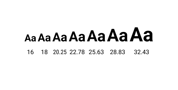
| Step | Actual Ratio vs Base Size | Pixel Size |
|---|---|---|
| 1 | 1 | 16 |
| 2 | 1.125 | 18 |
| 3 | 1.2657 | 20.25 |
| 4 | 1.4238 | 22.78 |
| 5 | 1.6017 | 25.6275 |
| 6 | 1.8019 | 28.8309 |
| 7 | 2.0272 | 32.4348 |
Here’s a type stack calculator that works this way. It even lets you select which musical interval or classical ratio to use.
Making Music with Type
I’ve discussed at length different ways of tuning or selecting “frequencies” for the “notes” available in our “scale”. Here’s a step by step process for putting it all together.
Select your scale methodology
This is only a step in the process. You give designers a palette to use. My suggestion here is to pick something your design team can use, that also balances a need to mathematically explain it. If you need the “golden mean” to defend the system, use that. This is an article about music, so I’m going to use the “Just Tuning” method. This method creates a scale with a lot of rational numbers when you start with 12 or 16 as a base size.
The decimals on the type sizes in any of the other scales make them more difficult to adopt for designers used to manually entering sizes. You can, of course, round off the unneeded decimals in your type sizes for simplicity, but that also compromises some of the mathematical symmetry and rhythm. As seen above, it’s these compromises that make our systems more useful to people at the expense of perfection.
It’s about being able to play the music, not about having mathematical perfection!
Select your “key”
Most apps use a base paragraph size of 16px. Other common sizes are 18px and 12px. Whichever one you select will determine the pixel sizes of your “notes” in your scale. In music, a key limits the available pitches you can play during a composition. In the same way, you might limit your available “notes” to something like this “major” key:
| Note # | Ratio | Decimal | Interval Name | 16 Pixel Equivalent |
|---|---|---|---|---|
| 1 | 1 | 1 | Tonic or “Root” | 16 |
| 3 | 9:8 | 1.125 | Major Second | 18 |
| 5 | 5:4 | 1.25 | Major Third | 20 |
| 6 | 4:3 | 1.333 | “Perfect” Fourth | 21.33 |
| 8 | 3:2 | 1.5 | “Perfect” Fifth | 24 |
| 10 | 5:3 | 1.667 | Sixth | 26.667 |
| 12 | 15:8 | 1.875 | “Major” Seventh | 30 |
| 13 | 2:1 | 2 | Octave | 32 |
Here is what that looks like:

Define what “chords” you want to use
A “chord” is combination of several notes played at the same time. Every chord has a certain feel to it. Minor chords feel melancholy. Major chords feel energizing. More complex chords can convey a mix of feelings all at once. The same chord can be “voiced” differently depending on how spread out all the notes are across the keyboard, and how hard those individual notes are played.
Think of a chord as a lockup of several text sizes next to each other. You’ll need a few of these options available to create your composition. Your headline is probably the largest size and highest “pitch” in the chord. Whereas a smaller font size is likely your “root”. Any subtitles or overlines might be a different “pitch” in the chord.
Here’s where some rules help you make something that sounds good.
1 - Avoid “notes” and type sizes that are too close.
When you play two notes at the same time that are very close to each other on the scale, you get a “dissonant” sound. It’s a bit like scraping nails on a chalkboard. Famously, sound designers have used this very sound when the monster strikes to add tension in horror movies.
If you have two type sizes next to each other that are too close in size, it might look like an accident happened. In design, you can mitigate this problem by using weight or color to contrast them. Or you can just put a piece of text with a contrasting size between them.
2 - Thirds, Fifths, and Octaves
A classic “major” chord will have the root (1) third (1.25 ratio), the fifth (1.5 ratio) and some octave of the root (2, 4, 8 ratios). On a piano, this is basically skipping every key.
Here’s what that sounds like:
In type, a “major” chord might look like type sizes 16, 20, 24, and 32. This would give you a solid foundation for a few type lockups.
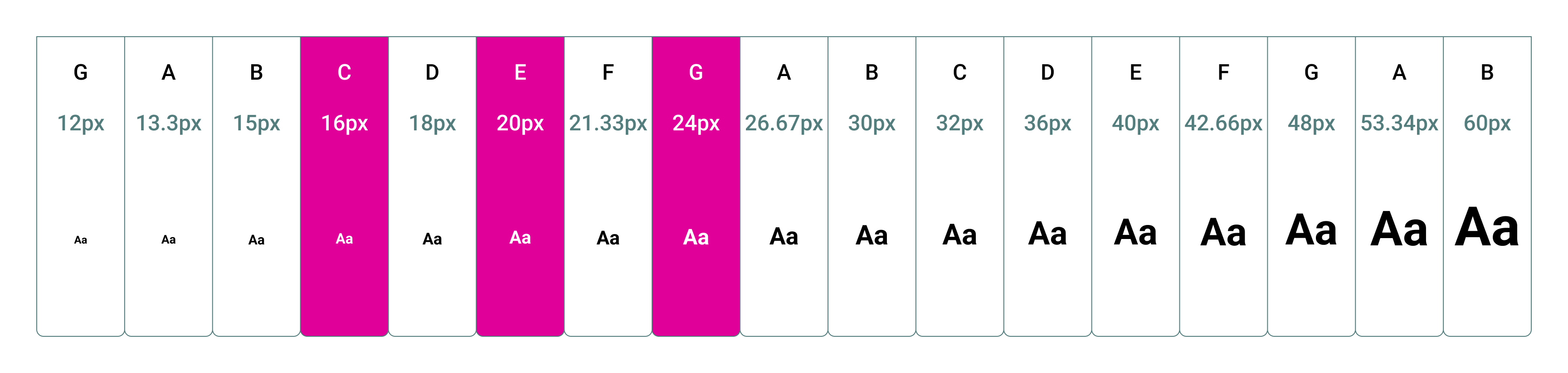
Or you could spread the same chord across the keyboard some more: 16, 40, 48, and 64 or 12, 16, 32, and 40.
If all you want to experiment with is what type sizes you have available, that’s a reasonable way to limit yourself.
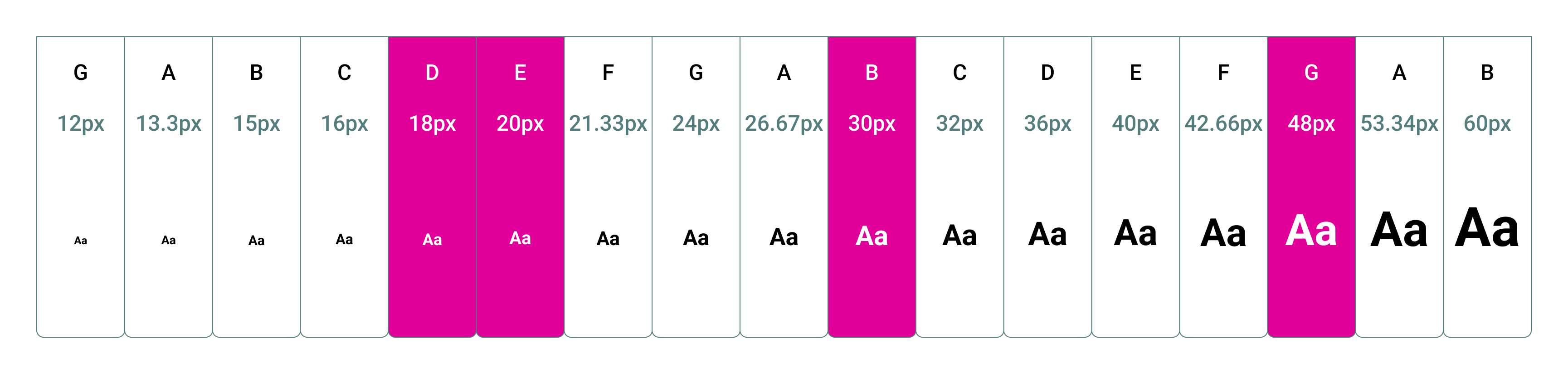
3 - Define several chords in your song
The simplest songs have 3 chords in them. A typical set of chords for a 3-chord song are the 1, 4 and 5 chords. Listen to any Creedence Clearwater Revival (ok, I’m dating myself here) album, and there will be several of these songs. This is also a very typical blues chord progression.
In type sets, these “chords” (in the “key” of 16px) would look like:
| Chord | Root | Third | Fifth | Octave |
|---|---|---|---|---|
| 1 - C | 16 | 20 | 24 | 32 |
| 4 - F | 19.2 | 26.667 | 30 | 38.4 |
| 5 - G | 24 | 30 | 36 | 48 |
| 5 - (lower G) | 12 | 15 | 18 | 24 |
Those three lockup scales would give you enough to create a fairly robust experience with some musical proportions to back up your type size selections.
4 - Get funky
You can really select any set of notes and make a chord out of them, if you find you need to. Musically, this works best when you spread the notes across the “keyboard”. It’s up to you the kind of music you want to create. Plenty of funk and jazz recordings use outlandish chords and uncommon keys (called ”modes” which we won’t get into here) to get a specific sound.
Here’s one way to make an “E7” chord:
We set up rules like this so we can boost our creativity by limiting choices. This allows us to creatively solve problems rather than merely nudge type sizes up or down all day.
Different voices
In music, there are different instruments playing at the same time hitting various different pitches in a “chord”. The type analog is font weight or color. The lead singer in a band can sing any note in a chord, but they always stand out above the rest. For type, they might be a bolder weight, or a thinner one with a much larger size, or some contrasting color.
It turns out that music and typography are both about creating contrast using different pitches and voices.
An example system
We might define our rules like this:
- Our “root” is 16px
- Our lockups contain a paragraph (the root), a headline, and an optional overline
- As the root gets larger, the headline size gets more steps away
- The overline is always 1 step down in size from the paragraph
- Headlines are bold
- Overlines are medium
- Paragraphs are regular weight
Here’s what some of those lockups might look like:
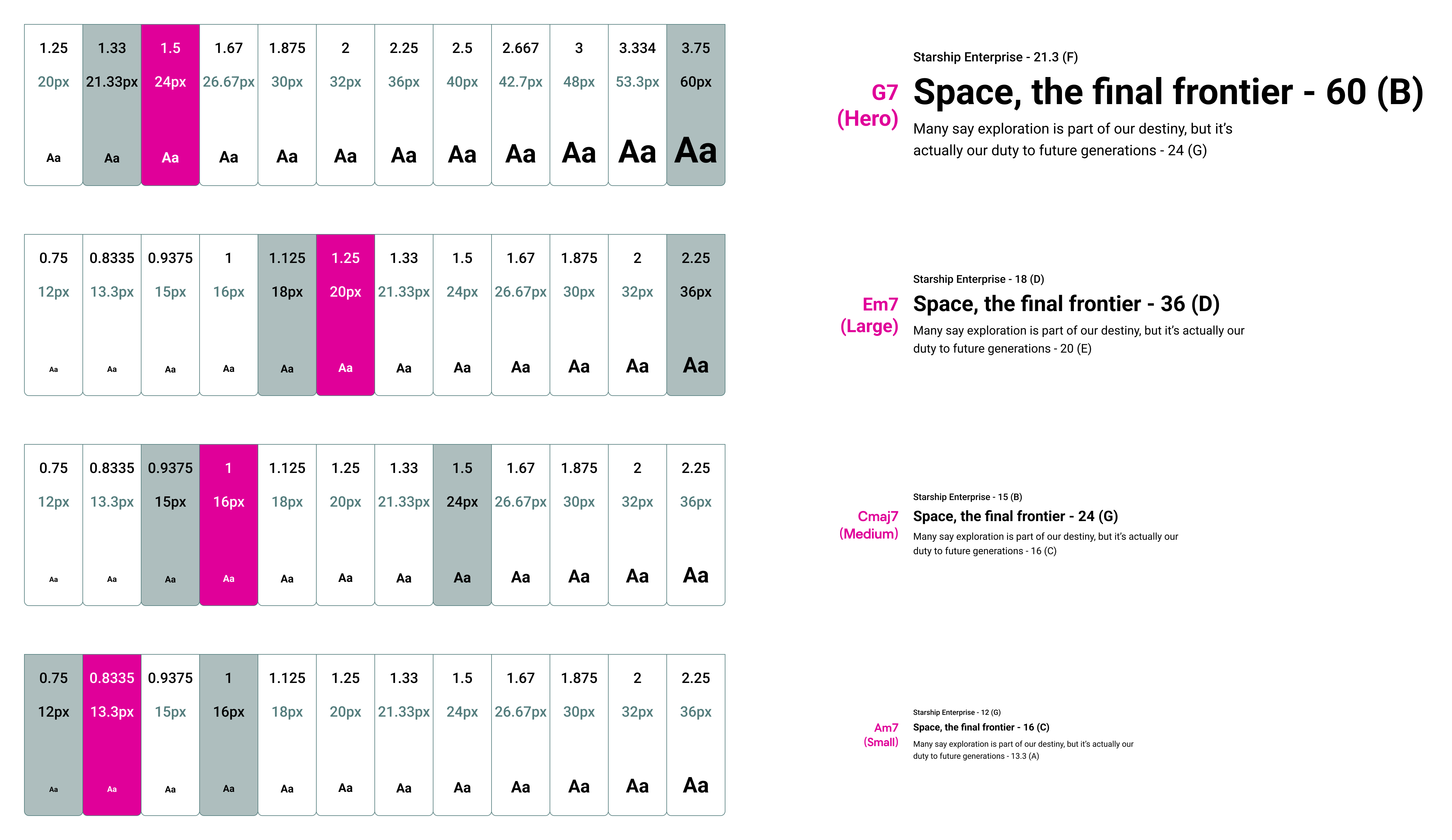
This system works for short-form content, like a marketing web site or product experience. For longer form, you might just define a couple paragraph sizes and headline levels to form a “chord”. This page you’re reading now uses “major chord” ratios to define all the headline sizes based on a single body content size.
Line height and spacing are relevant here too. This is a good time to try to do baseline grid alignment etc. if you can. But otherwise, keep it simple! Any one-off tweaks you make can compound your problems when your system scales.
Conclusion
Our modern music system is the result of usability engineering. Musicians and mathematicians worked together to define something more flexible and generally useful to play. The result is our pianos sound good no matter which key the music is written in.
Similarly, your design and engineering team need to work together to make a system that works for your company. I found that the application of music theory really “struck a chord” with my team. The approach scales well and is easy to adopt.
This particular method feels less like a mathy black box to my designer sensibilities. It results in a limited set of available sizes that can be easily guessed and typed in from memory in a pinch. Though, I always recommend creating robust libraries to take that guesswork out.